|
|
Post by sleepboy on May 28, 2010 15:35:36 GMT -8
|
|
|
|
Post by jemappellekat on May 29, 2010 3:34:20 GMT -8
Looking forward to this.
|
|
|
|
Post by bluesteel on May 29, 2010 7:25:53 GMT -8
Should be a good one. Some nice pieces going up around LA.
|
|
|
|
Post by Weezy on May 29, 2010 22:30:03 GMT -8
Any idea where? It'd be great to drive out to see what they've done/are doing.
|
|
|
|
Post by sleepboy on Jun 2, 2010 16:38:31 GMT -8
Some prints like the ones below will be released at 8pm (UK time) on June 9th around the time the exhibition itself opens to the public at 12pm (LA time). shopatlazarides.com 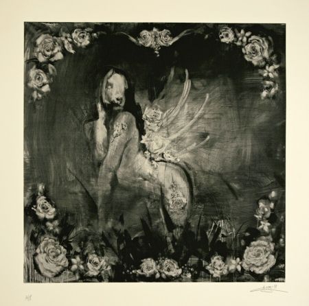 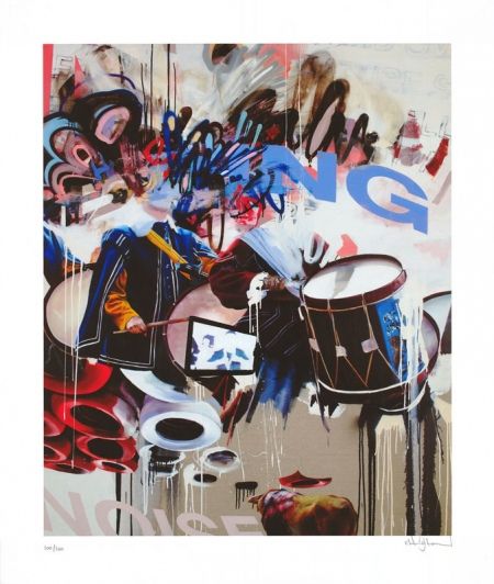 |
|
|
|
Post by virtu on Jun 2, 2010 17:03:28 GMT -8
Really like the top black & white piece.
Who is the artist?
Thanks
|
|
|
|
Post by svenman on Jun 2, 2010 17:13:16 GMT -8
Antony micallef.
This piece was shown at his show at laz last year. Stunning piece, with wonderful textures. I wonder what medium the prints are?
|
|
mike
Full Member
  
Posts: 154
|
Post by mike on Jun 2, 2010 23:33:13 GMT -8
I'm a big fan of Conor's, less so of Micallef, but find neither of these images particularly inspiring.
The graphic text on Conor's image is a real turn-off for me and marred a lot of what, for me, would have been truly great paintings at his last Laz show too. I'd much rather have some ambiguity than have the message spelled out.
|
|
|
|
Post by svenman on Jun 3, 2010 12:20:04 GMT -8
i remember we talked about the incorporation of the text at the last show back in october mike.
personally, i enjoy the clean text against the tags. it echoes his realistic paintings style alongside the more chaotic elements. but i am a bit of a freak for type at times.
i agree about this piece though, i'm not keen on the directness of the title of the painting being presented in text. i presume it's a hip-hop reference. not feeling this one as much as some of his other work.
i presume this piece will be in the show...
look forward to seeing the other work in the show.
sounds like he is flying out to LA tomorrow, so you locals may get some muralistic treats ahead of the opening.
|
|
|
|
Post by spenie on Jun 3, 2010 13:15:17 GMT -8
Love the Micallef, would imagine this could be screenprinted but the Conor print does nothing for me and it probably is down to the clean text, wish I'd have bought the hand finished "The Carnival Goes on" stands head and shoulders above any of his recent prints.
|
|
|
|
Post by sleepboy on Jun 3, 2010 20:04:12 GMT -8
|
|
|
|
Post by devours on Jun 9, 2010 12:54:09 GMT -8
Going back and forth regarding Conor's Bring the Noise print. Love the colors, but the text looks alien. I just know that it will sell out and I will regret it...or it will be on the wall and the text will irritate me too much. Been looking for a burst of color from Conor, but still undecided.
|
|
|
|
Post by svenman on Jun 9, 2010 14:04:16 GMT -8
so, any of you folks go last night?
what did you think?
|
|
|
|
Post by rkitek on Jun 9, 2010 17:54:43 GMT -8
I was curious to hear what others had to say who went to the show but since no one has come forward, I'll put in my two cents. There is no question that the people at LAZ know how to put on an opening. Not only was an army of valets waiting upon your arrival but premium alcohol was flowing all evening and they were "smart" enough to make sure they had the NBA Finals on in the corner next to the JR video installation. While this may not sound like much to those in the UK, I can assure you it was of paramount importance to those in LA. Perhaps they feared that if the game wasn't on somewhere at the show it'd be a pretty empty preview. So props to them for that. Turning to the art, I thought the quality of the work overall was very strong. Much better as body of work IMO than at the prior Choe show. I'm not saying that as a sleight to Choe as I like (and own) his work, but it is what you would expect to see when you have four artists showing rather than just one. I thought several of the Micallef pieces were strong -- which apparently was the consensus of those buying as most of the smaller pieces have already sold. This could be due, in part, to the fact that the prices for his work have come down to a somewhat more manageble level than at his prior solo show in LA. One of my favorites was a piece called "Study of a Kiss". Luckily it was sold otherwise I might have had alot of explaining to do at home. 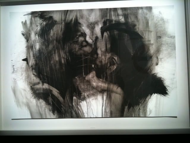 I also really liked a number of the Vhils pieces. This was the first chance I've had to see them in person and I found the processes he uses to create his work is relatively unique. Standouts were the chiseled brick/plaster installation pieces. Apparently, this is the first time that these pieces will be offered for sale by the gallery. Mind you, I'm not sure how one will be able to transport them without them falling apart in the process. 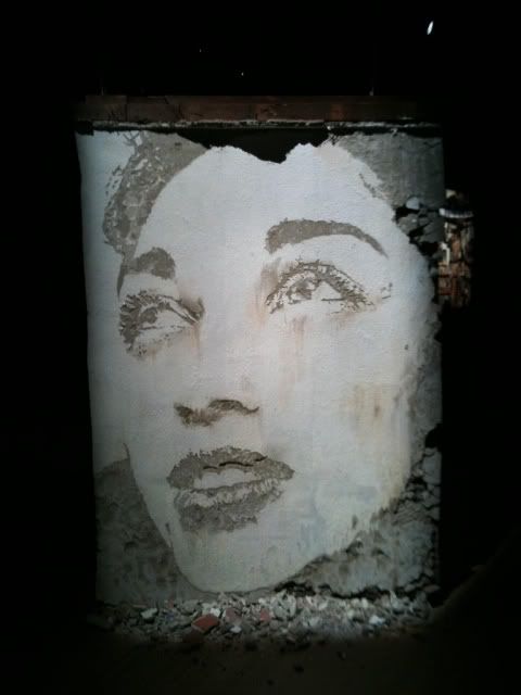 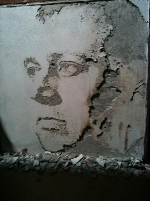 There were also a number of his layered pieces with resin that were impressive as well. I didn't realize it, but apparently in addition to using some stencils the faces he creates by applying the paint and then chipping away at it until he forms the faces you see. So the technique is a form of translation of the pieces he does on the street. 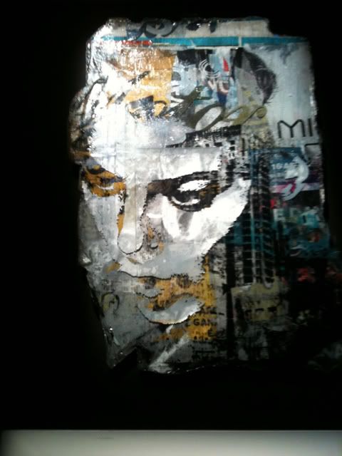 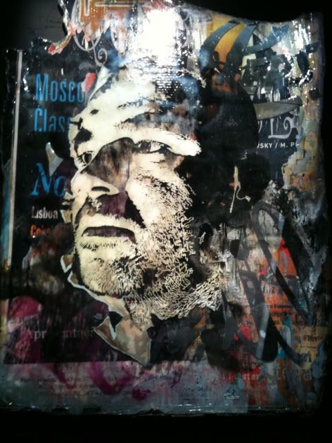 While I love the images that JR does, I think it's tough to compare them to his large scale works he has done. I mean they are beautiful images of these works but I'd much rather see the large scale works in person. And don't get me started on the prices. I'm running short on time just now so I'll have to conclude this later. Cheers. |
|
|
|
Post by LeBasse Projects on Jun 9, 2010 20:58:32 GMT -8
Loads of fun last night...great show all around. MY only wish was that it was split into 2 shows. More work than you could see and nothing i hate more than when work is hung higher than my head... and im 6'2".
Conor's new work is stellar...and glad prices were nearly doubled up otherwise i would have some 'splainin to do too...
|
|
|
|
Post by jemappellekat on Jun 9, 2010 21:40:08 GMT -8
It was a great night. There was a different feel (as opposed to the CHOE show), but great, nonetheless... Look out for Vhils show at a museum in San Diego mid-July.
|
|
|
|
Post by Weezy on Jun 9, 2010 21:50:10 GMT -8
I was very close to buying the chiseled woman's face piece. It's iconic Vhils, and a once in a lifetime opportunity because it's not like you could ship it. The walls came from a tear-down somewhere in LA. I'd measured the one space at home where I thought I might be able to put something so large and it was 8" short of fitting. Unfortunately I don't need another wall, because if I did... Clearly, the takeaway is that I need to move to a bigger place.  Highlight of the evening was chatting with Vhils. His new works are much more polished and refined, although I continue to prefer his earlier pieces like mine from the Compro Logo Existo series that are closer to the work he was doing on the streets of Lisbon and more strongly reference that experience. The chiseled pieces likewise. That being said, the pieces show a very clear evolution of Vhils as an artist, at least technically, translating the street to these beautiful and still mostly very interesting pieces. I like it where he plays off the images in the poster in the portraits, the best example of which was the woman's portrait with a man's head from one of the posters representing her iris. He used elaborate layering of poster and spraypaint in resin to great effect, particularly in the play of overhead light. Alex has been working like crazy. I hope he gets a few moments to enjoy LA to relax and catch his breath. From our conversation, that seems doubtful. He said he's got a show in the works at the San Diego Museum of Contemporary Art opening July 16. Blu and some others will be showing there as well. I will say that whomever Laz hires to do their lighting, I want them to come to my home and light my art. It'd be worth it even if my electricity bills were $1,000 a month, I had to keep the fire department on speed dial and the colors got bleached out within a week. It gives the impression that pieces are back-lit. That was particularly apparent in the large, dark Micallef with the human body and animal face, which really popped off the wall. This was the first time I'd seen the works of Antony Micallef. He is extremely talented-- all the buzz about him is warranted. But his talent as a painter applied to his grotesque subject matter results in work that creeps me out. A little creepiness can add a certain level of fascination, but Micallef's work in this vein too often crosses a line with me. My favorite Micallef was Plasticoid Spasticoid, which showcased his talent but also fun-- although I was disappointed to see that the very effective upside-down lipsticked lips below the animated eyeball and the balloon ends were collaged on rather than painted. Some of the charcoal pieces were nice, but for me not enough to justify the price tag-- I will say they looked much better live than in the digital images I saw. I personally was not impressed at all by the Harrington pieces. I expected them to be very colorful and really pop. Instead they seemed muted and flat, which is saying something under Laz's lighting. And I didn't get any sense of a point from the soldiers mixed in with the spraypaint, and they left me cold. I very much appreciated the great storyline behind the making of the JR pieces, even if they were not really my particular taste. All in all a great show from Laz, keeping the momentum going from the Choe show. And I'll certainly say these shows are fun to attend. I'm particularly proud to make it though and stick to my collector's hit list, which represents enough financial irresponsibility. Those are Weezy's 2 cents Great to read all the impressions! Jemappellekat, I looked about for you to say hi, but I didn't see you. Maybe next show. I almost missed Commandax, but fortunately I ran into her when she was leaving. The whole point of going to a preview is seeing everyone you know in addition to the art. |
|
|
|
Post by sleepboy on Jun 9, 2010 21:57:27 GMT -8
I was most impressed by Micallef's work. That huge piece with all the skeletal figures was stunning.
Vhils, I loved the chiseled wall pieces but didn't like his "gallery" pieces with the resins. For some reason, the colors don't work for me.
There were some nice Conor Harrington's but when he gets too abstract, I feel it gets a little messy for me. The pieces I liked the most had a central "character."
JR was nice but yes, I think it works better on a larger scale. Perhaps if he used more found objects with more irregular shapes, it would have been a little more interesting.
Gallery has definitely nicely done and must have cost a pretty penny. But, I was one of the ones that was watching the Laker game.... very convenient.
|
|
|
|
Post by sleepboy on Jun 11, 2010 20:31:32 GMT -8
|
|
|
|
Post by svenman on Jun 12, 2010 16:06:22 GMT -8
sleepboy, that micallef parasite piece is really stunning. glad you guys got to see that over there. he talked about that piece a little in the interview i did with him last year... arrestedmotion.com/2009/09/interview-preview-antony-micallef-becoming-animal-lazarides-london/interesting to hear all of your opinions on the work and the artists. i often wonder how the uk (and irish, of course) artists are seen over in the usa. seems like the show was pretty popular. it looks like a pretty strong show from the images i've seen here and on AM plus the preview pdf. some of conor's work i think is not as great as i've seen previously and this time some of the text is a little overbearing for me, and that is said as a big fan of text in art... the micallef work looks damn fine, albeit some has been displayed previously, still, only in the uk. i love what jr does on a grand scale outdoors. his work displayed in a gallery though does absolutely nothing for me. i think a lot of the impact of the scale and placement is lost and along with it so is the dynamic of his work. |
|