|
|
Post by sleepboy on Oct 14, 2010 16:33:22 GMT -8
|
|
|
|
Post by rsingletary on Oct 14, 2010 21:10:53 GMT -8
MESSAGE FOR: sleepboy
___________________
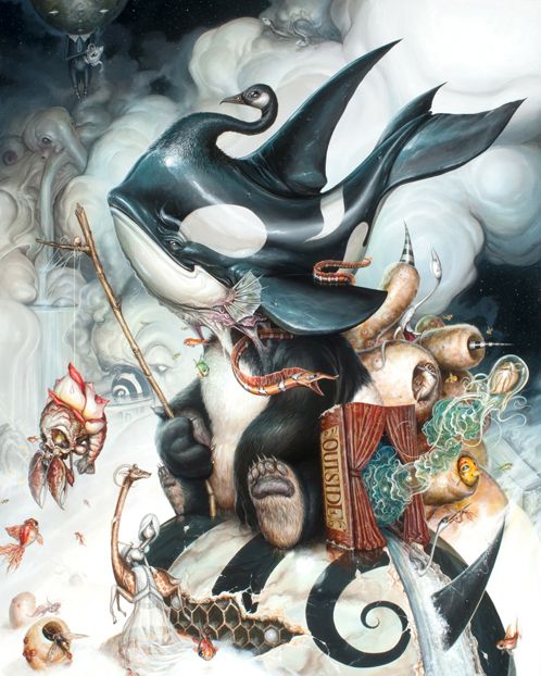
WOW !! Thanks for posting this great work
by GREG craola Simkins.
How recent is this piece ?
What's the size ?
I assume it's a painting...but is he going to produce
a limited signed/numbered edition ?
PERSONAL NOTE:
This is a day of celebration for me. A dealer up north
SOLD another artwork of mine......so, Monday
October 18, 2010 .....I'll receive $ 1,010.
( special delivery ) for my part.
Selling during this recession is difficult at best.....so, I'm
very appreciative.
__________________________________________________
Signed: Robert Singletary__Friday October 15, 2010__1:10 A.M.
(eastern standard time) USA
|
|
|
|
Post by twocool4u1 on Oct 15, 2010 13:58:43 GMT -8
theres a making of video of this painting on youtube for juxtapoz i think..
|
|
|
|
Post by saL on Oct 15, 2010 14:03:19 GMT -8
here is a video of him making this fantastic piece -
(shared from the other Craola thread)
|
|
|
|
Post by jemappellekat on Oct 16, 2010 0:30:50 GMT -8
I hope that they have a book release party/signing, as well..
|
|
|
|
Post by twocool4u1 on Oct 16, 2010 10:39:43 GMT -8
|
|
|
|
Post by sleepboy on Oct 24, 2010 8:18:18 GMT -8
|
|
|
|
Post by thinkspace on Oct 24, 2010 20:56:14 GMT -8
Those box sets look SOOOO good!!!!
|
|
|
|
Post by lowpro on Oct 24, 2010 21:17:23 GMT -8
Looks like he's drawing inspiration from that Direct TV commercial with the baby giraffe and the wealthy Russian. That ad rules.
|
|
|
|
Post by gildoinc on Oct 24, 2010 23:06:45 GMT -8
I thought the exact same thing Lowpro. Here is the commercial for those of you who haven't seen it. I love it, especially the dogs playing poker in the beginning.
|
|
|
|
Post by jemappellekat on Oct 25, 2010 4:31:23 GMT -8
Those box sets look SOOOO good!!!! Agreed! |
|
|
|
Post by sleepboy on Oct 25, 2010 9:14:16 GMT -8
Haha, love that commercial too.
|
|
|
|
Post by sleepboy on Nov 2, 2010 17:30:58 GMT -8
The print for the show.  |
|
|
|
Post by twocool4u1 on Nov 3, 2010 7:54:43 GMT -8
craola1.blogspot.com/"Finding Home" a new print by Greg "Craola" Simkins Giclee print on canvas 24 x 18 3/4 in. Edition of 20 Hand Signed & Numbered $425 USD
|
|
|
|
Post by saL on Nov 3, 2010 10:33:33 GMT -8
this print is SCARY good!.. if I wasn't after his OG, I'd be all over this.. actually, I still might change my mind.. hehehe
|
|
|
|
Post by Weekender on Nov 3, 2010 10:59:59 GMT -8
Looks like he's drawing inspiration from that Direct TV commercial with the baby giraffe and the wealthy Russian. That ad rules. Now it makes sense when connected to the other post on the billionaire in Mumbai with the crazy house. Anyway, great box sets shown in the pics! |
|
|
|
Post by saL on Nov 3, 2010 14:00:03 GMT -8
|
|
grit
Full Member
  
Posts: 139
|
Post by grit on Nov 3, 2010 16:44:51 GMT -8
Damn, I swear his technique gets significantly better every single show. I cant wait to see all the paintings.
|
|
|
|
Post by sleepboy on Nov 4, 2010 21:31:13 GMT -8
I think this one is my favorite. Too bad I don't have 22K lying around. Looking forward to seeing this in person tomorrow night.  |
|
|
|
Post by saL on Nov 5, 2010 0:56:08 GMT -8
Damn, I swear his technique gets significantly better every single show. I just saw the preview, and Im thinking the same thing.. a lot of time it happens that I prefer "older works" of some artist, but Craola keeps getting better and better.. clap! clap! |
|
|
|
Post by lowpro on Nov 5, 2010 2:58:49 GMT -8
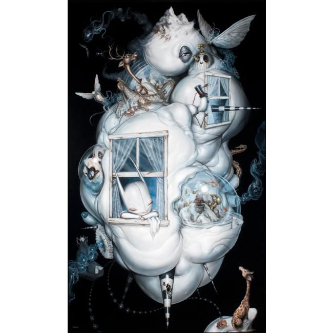
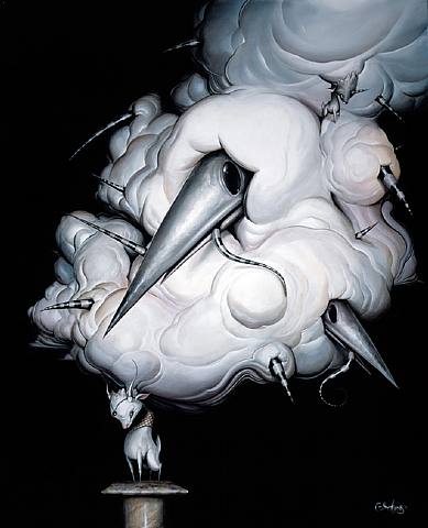
Damn, I swear his technique gets significantly better every single show. I feel his work has just gotten more and more cluttered too. There's something to be said for negative space in a painting. You don't have to cram every last little idea you have in a piece so as to create a sensory overload situation. It seems it's just me. But some of those pieces from the It Wanders series, with the white goo and the more minimalistic compositions, are still my favorite works..and that was back in 2008. In terms of technique, those works are executed just as proficiently as these too. This piece, Never Alone, which initially I was taken aback by due to the monochromatic palette, is one of his finest works IMO, in part because it's so less loud and in your face than most of his work. Has grown on me immensely overtime.  Duchess Dreaming is a still a favorite as well.  |
|
grit
Full Member
  
Posts: 139
|
Post by grit on Nov 5, 2010 13:02:22 GMT -8
I suppose its a perspective thing lowpro. Greg is definetally filling the space in the larger pieces from this show, but the smaller size works from the preview still make good use of negative space. I actually love it when he uses all the space available on the canvas, and to me it very much complements his style and imigary. Thats just my taste.
I find it really hard to talk about technique, because i dont have any art training and do not have a good grasp of the correct language to use when trying to express my point. However from a visual perspective whilst Gregs work from 2008 were still amazing, the work now seems to be much smoother and more refined. When I look at some of the 'Knight' characters in the older works to the ones now, they seem significantly more detailed and rendered in his recent pieces.
Thats just my view puerly from how my eyes and brain react to the images. Im far from an expert
|
|
jarren
Junior Member
 
Posts: 81
|
Post by jarren on Nov 5, 2010 13:28:36 GMT -8
can't wait for this show I wonder what prints he will make
|
|
|
|
Post by Weekender on Nov 5, 2010 13:48:45 GMT -8
|
|
|
|
Post by LeBasse Projects on Nov 5, 2010 16:04:39 GMT -8
Just popped by 1988 with Eric Fortune. What a nice show from Greg...go see if you are free...totally worth the price of admission.
|
|