I will start this by saying that I am overall very excited about Darmstaedter’s work and that I have purchased his work for my collection. I like to be upfront with this type of disclaimer, so that if you feel I exhibit bias or whatnot and just want to write off what I say, you easily can.
Paulypaul asked a great question, “So what are they about? The penny ones and the magnets, what’s the thinking behind them?” That I can’t answer, and I would argue neither could Darmstaedter, for “The creative act is not performed by the artist alone; the spectator brings the work in contact with the external world by deciphering and interpreting its inner qualifications and thus adds his contribution to the creative act.”(Marcel Duchamp). Darmstaedter could tell you what he intended, what he set out to do, but, at the end of the day, his is only an opinion as well and, “What you see is what
you see.”(Frank Stella, emphasis added).
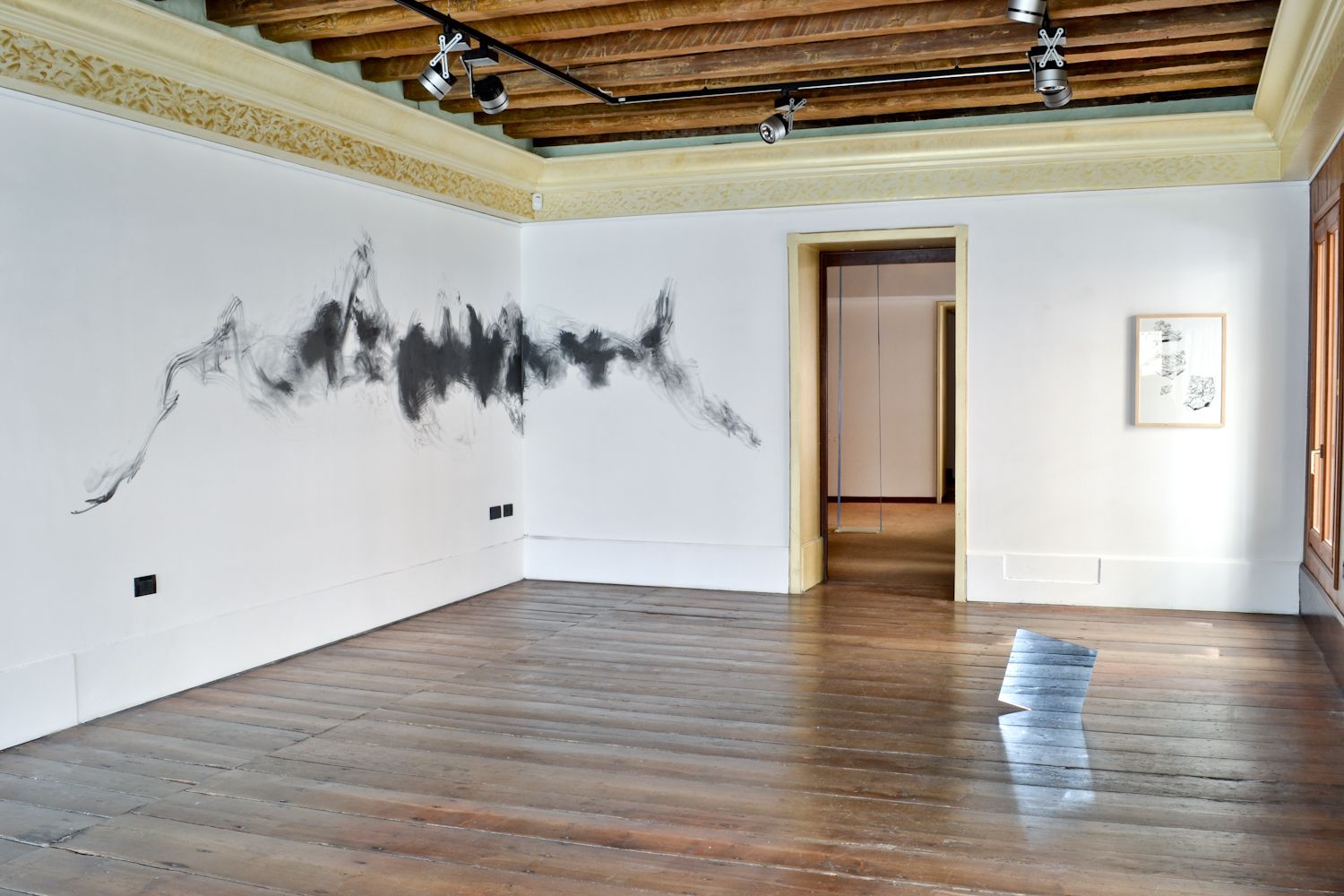
So, I will discuss what I see in these works, given my limited experience with them and, admittedly, somewhat limited art-historical background. This will likely ramble a bit, so bear with me and I might end up editing this several times to patch sections I later find embarrassing.
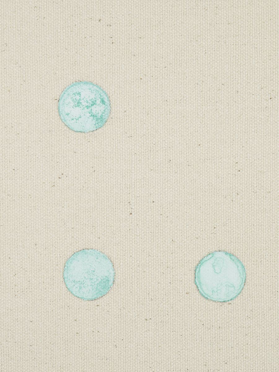
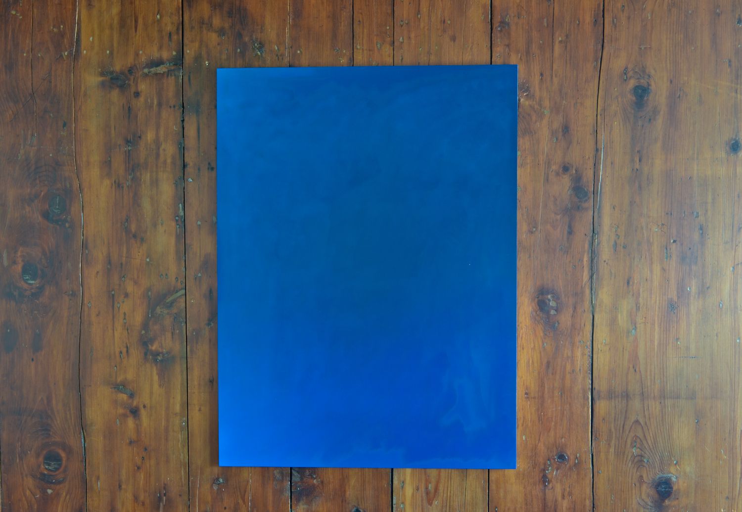
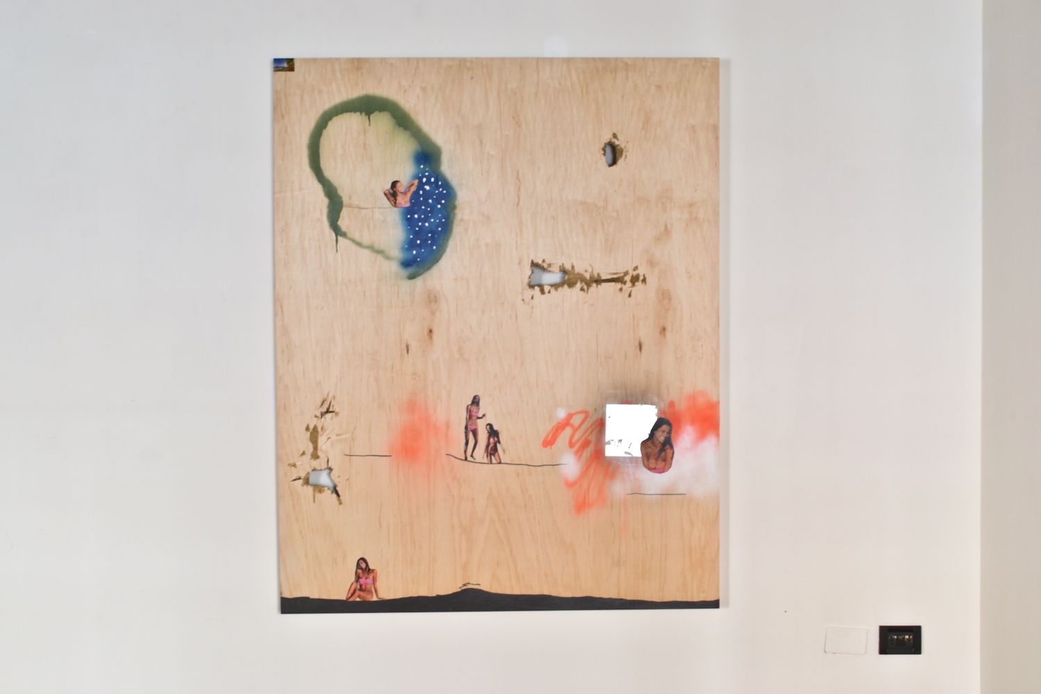
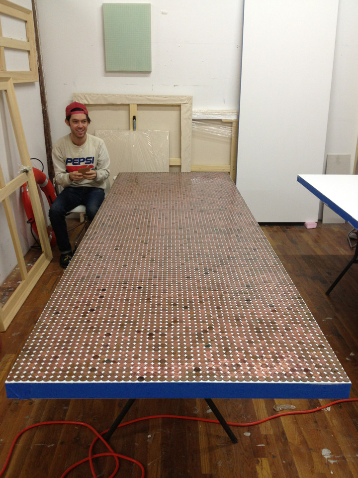
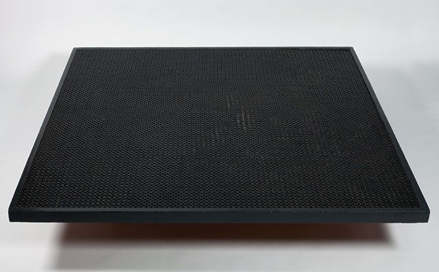
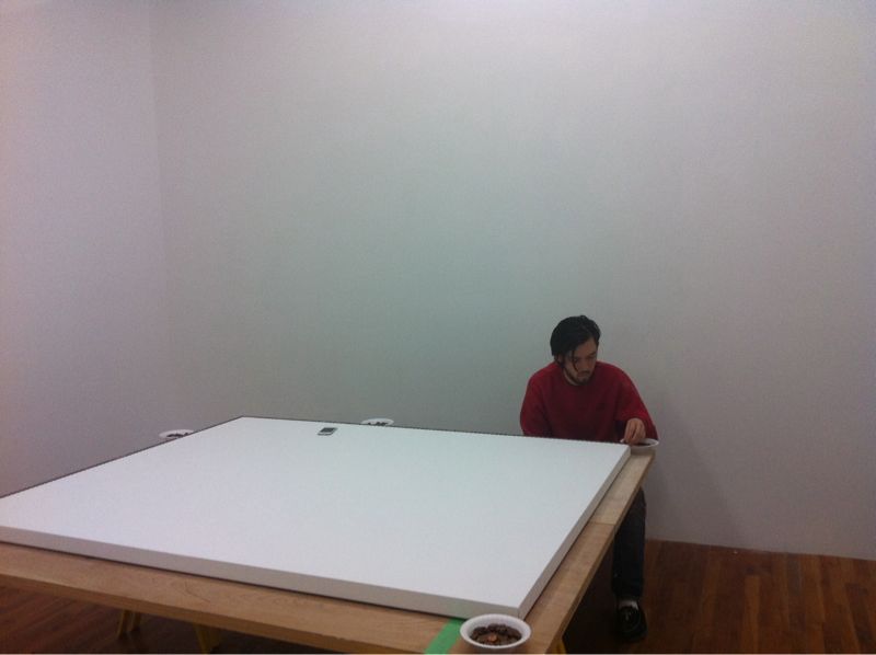
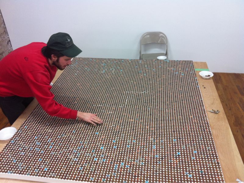
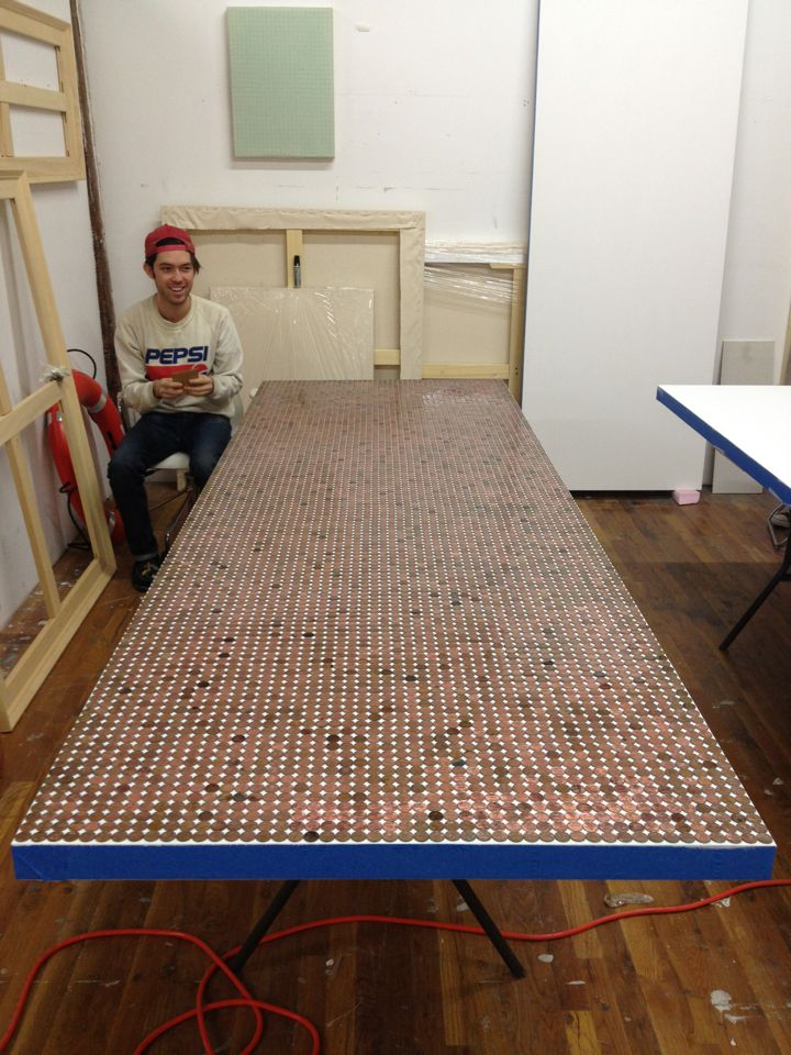
I will begin by turning to the series of works I was exposed to first, namely the penny paintings series. I think instantly, everyone can see the very Pop art elements being highlighted in this series. Using a very basic, though accepted, definition of Pop art, we can see that both the Darmstaedter series most definitely, “employs aspects of mass culture such as…mundane cultural objects.” The penny paintings making use of perhaps the most mundane of American cultural objects, a store of value that practically has none, an object who’s continued existence is not rational, it costs approximately 2.4 cents to mint a penny, but rather nostalgic, something so dull that most won’t take the time to pick it up off the ground, yet so ingrained in the American psyche that the backlash to its elimination would be monumental. And even more curious about the penny and its rather firm place in American culture, most surveyed still believe the penny to be made of copper, as it was in their youth. This has not been true in over 30 years, which is why Darmstaedter must turn to pre-1982 pennies for the formation of Verdi gris. The modern penny is actually 97.5% relatively-inexpensive zinc, with only a slim 2.5% copper coating, a clad composition that, unlike all prior US coins, is considerably hazardous if ingested by children or domestic animals. I believe a greater narrative could be written about America valuing low-cost over its very health, the Walmartization of the country, but that is for another day, though could very much add to an appreciation of Darmstaedter’s oeuvre.
To further explore the association between the penny paintings and 1960’s-era Pop, I believe a simple visual comparison is in order:
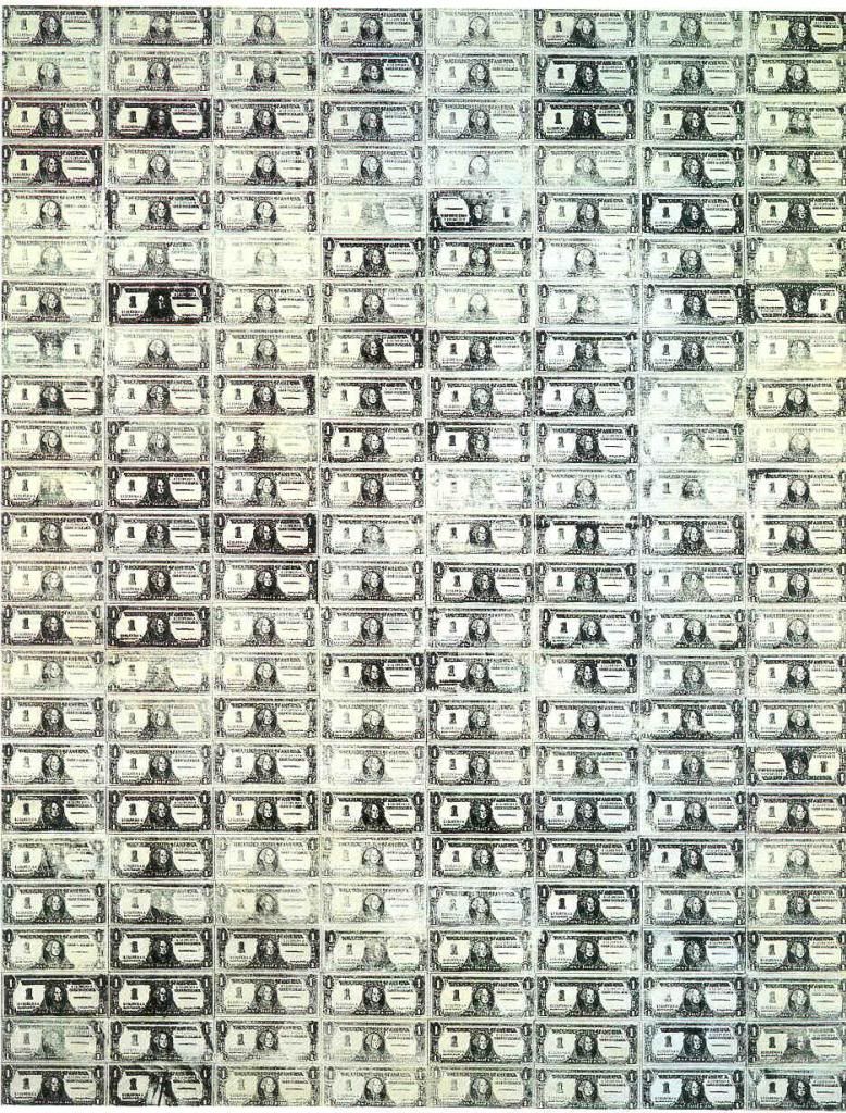
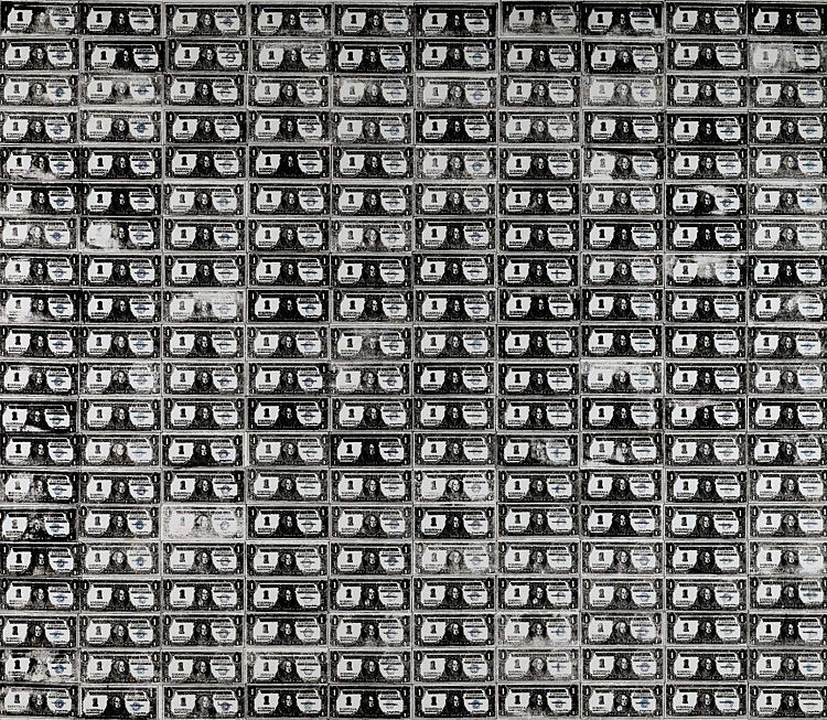
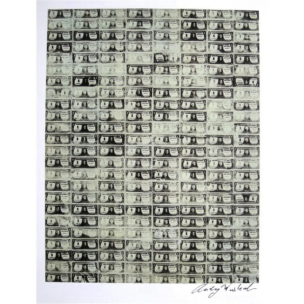
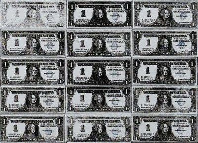
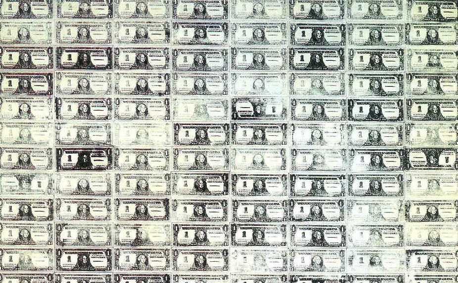
The above are just a sampling of Warhol’s many currency-based artworks(I do not have the Warhol catalogue raisonne, wish I did, because I would really like to know how extensive this thematic series was). I think just even a quick visual inspection shows a definite relationship between the two artists’ works. In Warhol’s case, what some might call poor silkscreening technique, and others would call artistic practice, resulted in pressure, and therefore ink, variations in the final print. These ‘errors’, or ‘artistic expressions’ are similar in nature to the variations resulting from the chemical reaction between copper, vinegar(acetic acid and water), and salt that results in the deposition of Verdi gris on the unprimed canvas. Fun fact, adjusted for inflation, each of Warhol’s dollars is now only worth about 13 of Darmstaedter’s pennies.
Continuing with Warhol, the great Pop master was also no stranger to copper, Verdi gris, and fun with chemical reactions. His infamous series of ‘piss paintings’ aka ‘oxidation paintings’ clearly attest to that:
I would also like to point out similarity between Darmstaedter’s process and another artist who is associated with Pop – Robert Rauschenberg. Back in the early 1960’s, Rauschenberg was developing multiple methods of image reproduction in his artistic practice. Namely, he was championing both solvent transfer and silkscreen(fun fact, he and Warhol were developing their techniques at the same time, were friends, and would share tips and tricks). His solvent transfer technique is shown below:
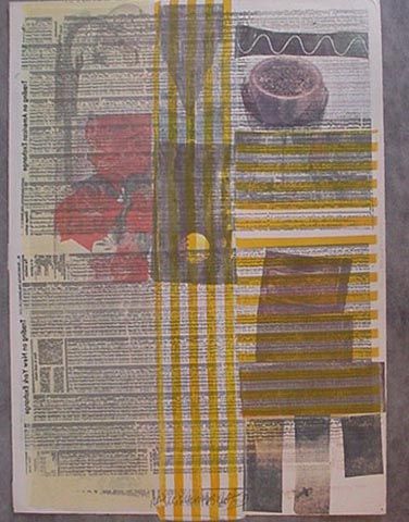
I think the parallels are there. Rauschenberg used a chemical process involving solvents to transfer images of newspaper clippings, another mundane American cultural icon, into his work. Darmstaedter, in his ‘Penny Paintings’, uses the process for creating Verdi gris to do the same - transfer images. I think they have much the same effect as well, though Darmstaedter showing a far narrow, singular focus.
But, the ‘Penny Paintings’ don’t stop anywhere near their pop influence. Instead, in many ways, they are an amalgam of many 1960’s-based practices and, as a result, emerge as a unique breed unto their own, denying label and easy classification. For instance, from the Pop material usage, and the visual similarities to an iconic Pop series of paintings by the most well-known(some would say over-exposed) artist of the post-war era, the penny paintings take a rather substantial detour toward a fertile ground of under-appreciated practice. Namely, the penny paintings serve as an extension of the work of two of the most stunning examples of artworld sexism and uncategorizable genius – Agnes Martin and Eva Hesse.

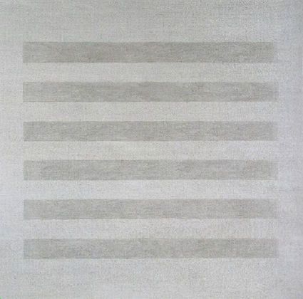
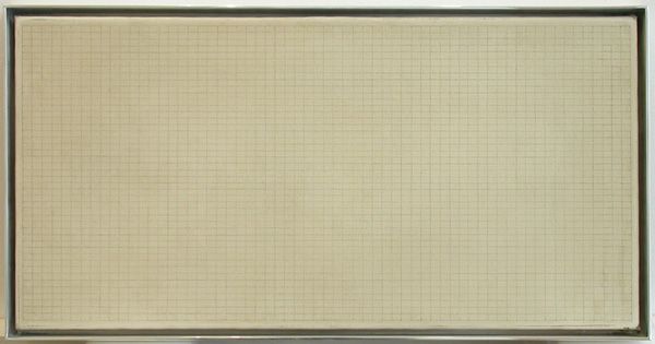
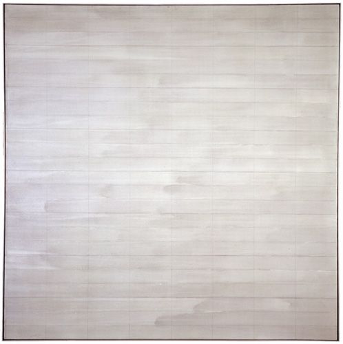
I apologize. It is almost unfair to talk about Martin online, as her work is one of the hardest I’ve come across to photocopy. It is damn near impossible to do it justice in any way, shape or form. But, all I can do is post these poor images and encourage you to run to the nearest museum blessed with a Martin painting and appreciate for yourself.
Now Martin, whose auction record is only $4.7 million btw(or about the price of a meh, fifth-tier Warhol), classified herself as an abstract expressionist. In my opinion, that is rather obviously false, but understandable given her respect for the reductive approach many of the non-action Abstract Expressionists took(Rothko, Reinhardt, etc.). In fact, of Rothko and his late-style, Martin stated that he, “reached zero so that nothing could stand in the way of truth." This reductive trend, cutting away all extraneous, has led others to falsely conclude that Martin was a minimalist. That displays a somewhat shortsighted view of what minimalism, in the Judd definition, is. Yes, Martin is built of a grid like, say, Lewitt. Yes, there is seriality like Judd, like Lewitt cubes, etc. But, unlike those deans of NYC minimalism, in Martin there is always the artist’s hand. This isn’t mechanical reproduction, not the specialist-led fabrication of the great Judd’s, or, to an almost ridiculous extent, Lewitt’s putting forth the idea that artwork execution was not even necessary. With a Martin, up close, you always recognize the work. The slight squiggle of what should have been a straight line, the erasure, the signs that the artist herself had been there and that her presence was integral.
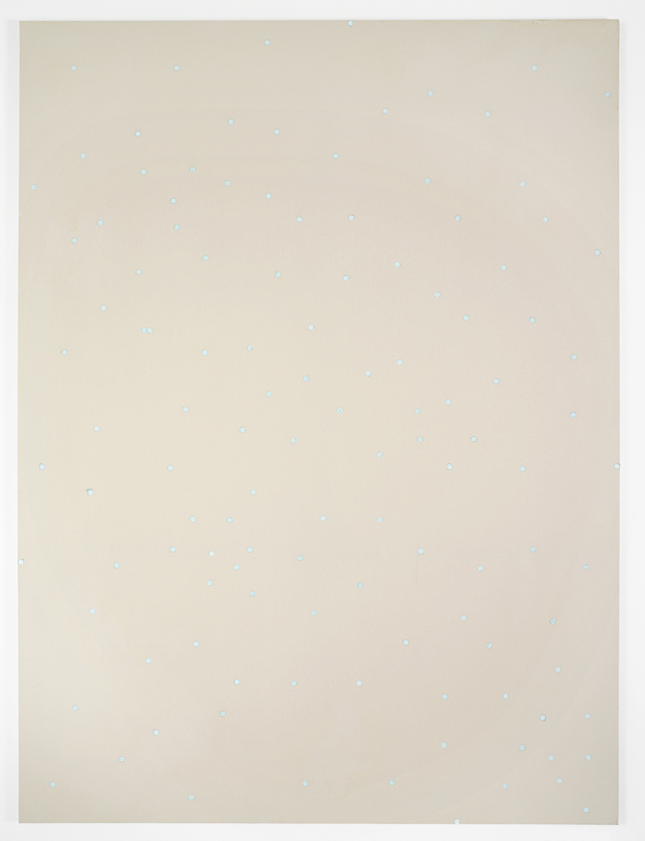
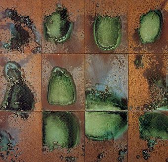
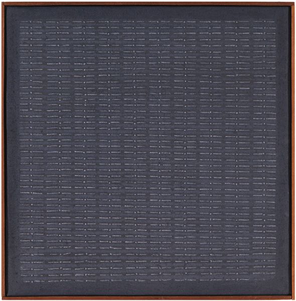
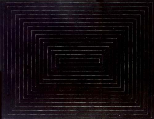
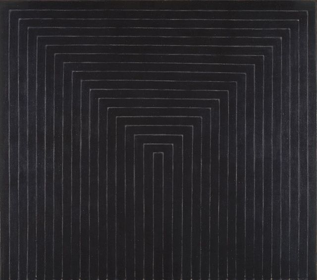
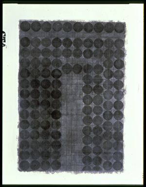
Much like Martin, Darmstaedter’s penny series also bases itself on a human-imperfected grid. Like an early Black Painting by Frank Stella:
Darmstaedter’s columns and rows show easily perceivable variance.
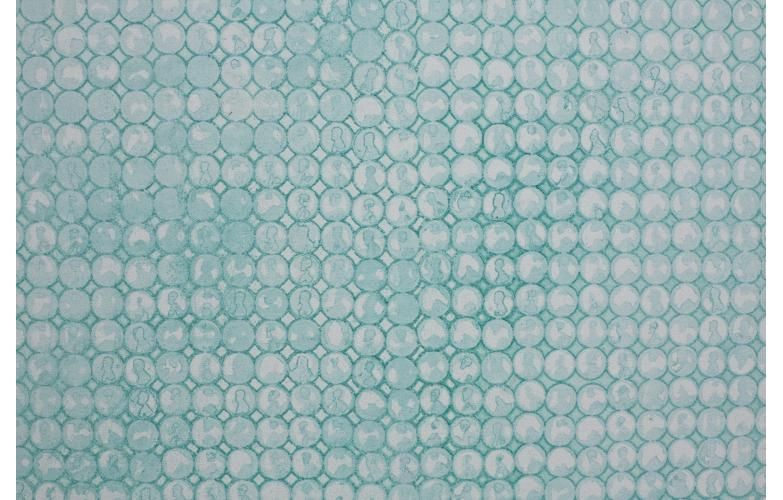
As you can see in this close-up, coins are rotated, misaligned, etc. The structure is ‘off’, which enhances the effects of the already-discussed variations results from the Verdi gris process. And this ‘offness’ is easily palatable to us as viewers, as we are accustomed to imperfection. Our eyes even adjust, like with a Martin, to gloss over, to mentally unify things, to ‘tidy up’ when at just a bit of distance. That is why the prim perfection of ‘proper’ minimalism stands out as so alien. It’s because we do not see examples of such precision in our dailies. For example teeth. Look really hard at someone that you think has a great smile. Focus. See the inherently human imperfection? On the other hand, we all have seen the weatherman, with his ‘too straight’ and ‘too white’ teeth reading as a beacon of falsehood. They are merely illusion.
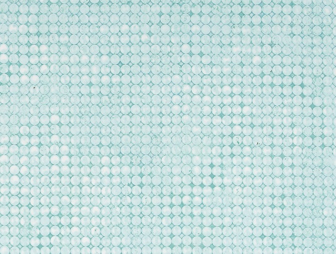
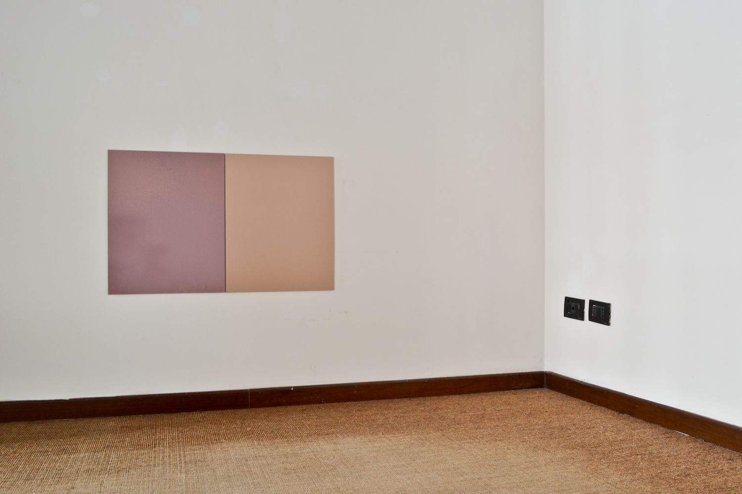
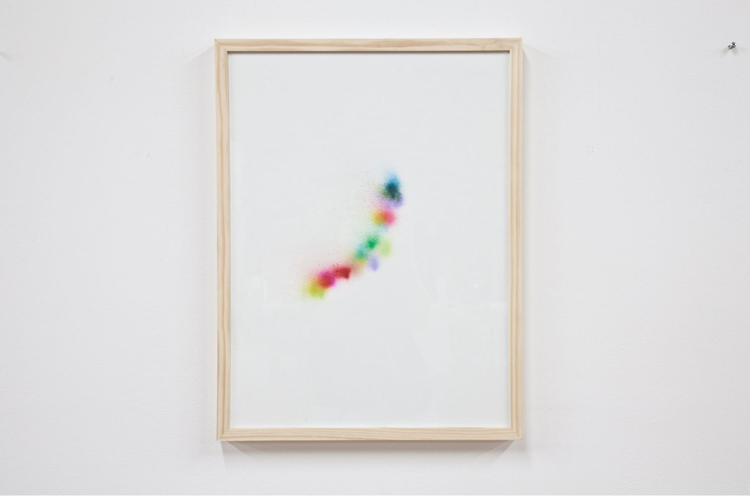
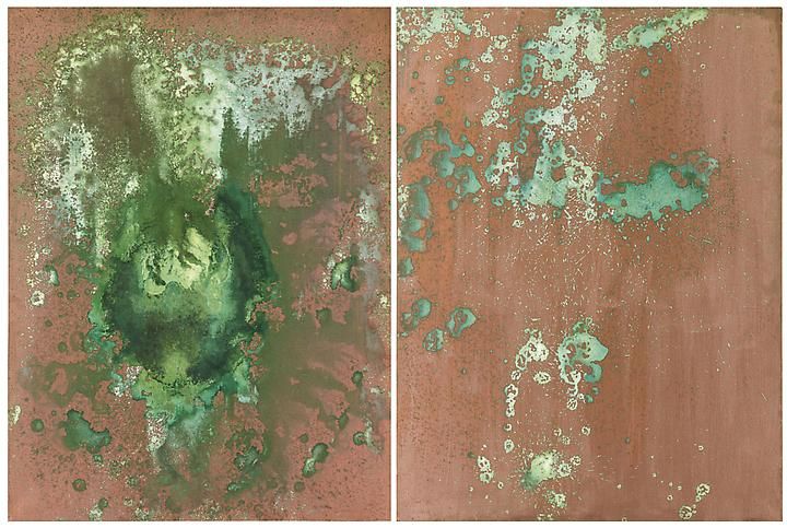
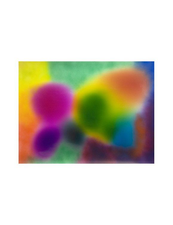
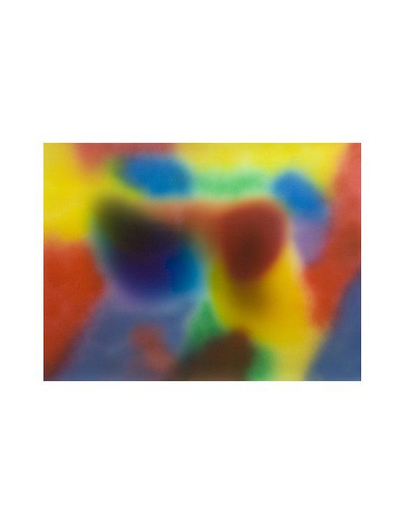
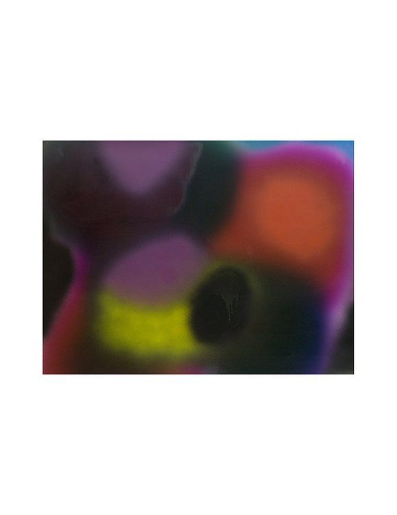
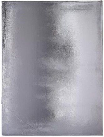
If he were a proper minimalist, we would say that illusion does not not come into play with Darmstaedter's work. They strove to eliminate the illusionist tendencies of painting through perfection of process, through 'specific objecthood' if you will. But, Darmstaedter isn't a minimalist, so we must ask if illusion does come into play. Stare at the image below for a while if you would. Let your eyes ‘go’.
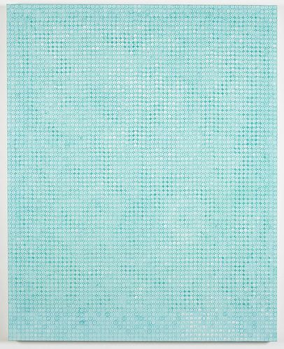
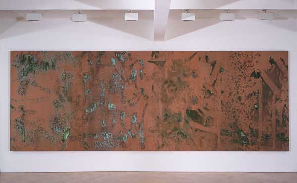
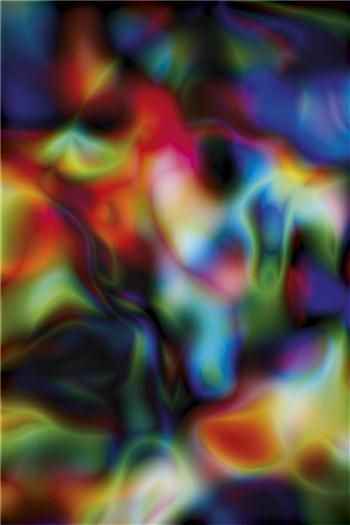
Can you see what I see? When I stop my eyes/brain from unifying/tidying, it does quite the opposite. For me, out of this imperfect structure comes biomorphisms and strange forms, that spring into my vision, flit about, and recede only to emerge again grossly distorted, continuing to dance. Warhol-ian ink blots emerge, remind me that I am crazy, and disappear in a flash. I see things like what is being capture much more explicitly by Rothko:


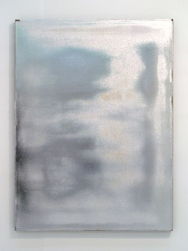
By Thomas Ruff with his substrate series:
And even by Darmstaedter’s contemporary Sam Falls in multiple series:

Now, I must say I prefer Darmstaedter’s more subtle effects in this realm. The only other current, young artist that has capture this as sly-ly and, for me, impressively would be Jacob Kassay. If you get a chance, spend some time with a Kassay, and, “…see what you see.”

Now, you may ask, “Why would you want this hidden? Why do you find whiffs of it more impressive than blunt presentation?” Fair question. In my opinion, art hasn’t been about blunt presentation since the popularization of the photograph and perhaps before. Abstraction, in many ways, is embraced due to it being almost akin to delayed gratification. You must work, kind of a combination of the opposite of “easy come, easy go,” and “if it’s not hard, it’s not worth doing.” I also compare abstract/conceptual art to alcoholic beverages. If you want something that explicitly tastes like berries, something that is ‘easy’ and straightforward grab the cheap alcopop. If you want to delight with, “notes of sticky toffee, earthy oak, fig cake, roasted nuts, fallen fruit, pancake batter, black cherry, ripe peach, dark chocolate covered espresso bean, polished leather, tobacco, a hint of wild game and lingering, leafy damp kiln smoke,” well, then you need to go for the hard stuff(in this case, Black Bowmore0.
But, back to minimalism for a bit, though more accurately post-minimalism. We have already review how the heavy importance of artist’s hand, how the embracement of ‘imperfection’ really pulls Nick’s penny paintings outside of the realm of minimalism, despite the art historical heft and power of ‘the grid’. Famed art historian and critic Arthur Danto clearly delimited post-minimalism from minimalism proper due to its use of “nonmechanical repetition”. This is seen in Martin’s work, of course, but I think was taken to greater conceptual heights by Eva Hesse – the single most under-appreciated yet influential artist I can think of(unfortunately for her, she has/had two strikes against her. A. she is a she and B. she died at only 34). Below are some examples of her mid-1960’s work:
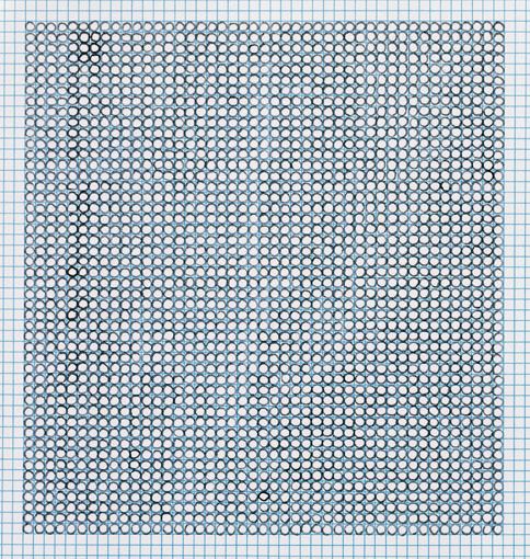
And I think the greatest example for illustrating linkages to Darmstaedter, this is Eva Hesse’s ‘Washer Table’ from 1967:
I will quote James Meyer, the greatest minimalism scholar and author of the best genre book I’ve read ‘Minimalism: Art and Polemics in the 1960’s, “Eva Hesse was given a square white wooden table by Sol Lewitt which she transformed by methodically covering it with almost 700 black rubbers washer and painting the frame in black. Here as in other works integrating identical units by Hesse, the organizing impulse of Minimalism is rendered absurd through pointless repetition.” That’s the really salient point. Hesse’s work, exemplified by this table, turns two of minimalism's defining features – seriality and minimization of artist hand – into critiques but also jokes. It’s almost a mocking of the organizational/perfectionist impulse. I see much of that same wit, that same impulse, in pictures like:
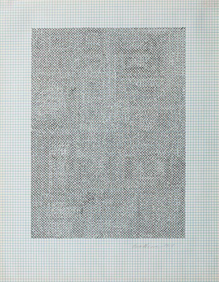
Which is also shared with the great Italian jokester Alighiero Boetti, in works such as:

Which are made from the constant repetition of ballpoint pen marks, tens, if not hundreds-of-thousands, of ballpoint pen marks, taking seriality, with the human hand, to the extreme. Obsessive, insane, and some might say even inane. But, effective as a critique for just those reasons.
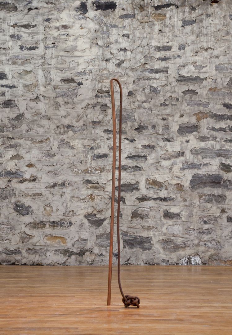
Well, on this note, I am going to go to bed. Gotta be up early to open presents. I will probably go into the magnet pieces, which I may actually find even more intriguing, some time soon. But, I will end by saying, I see wit, I see art historical understanding, and I see a lot of fantastic potential in what I’ve seen from Darmstaedter. I agree with Bill Powers, he is definitely one to watch.