|
|
Post by masao626 on Dec 6, 2008 12:12:27 GMT -8
so now that i've conqured the framing job of 2/3 earley's - i'm looking for opinions and input on the last one - "The Wish". so do you think she's better in a creamy frame (not gold) or a darker frame? i'm leaning creamy...(forgive the pictures, they're crude mockups)  Added: 2 examples of Lori's framing of this print:  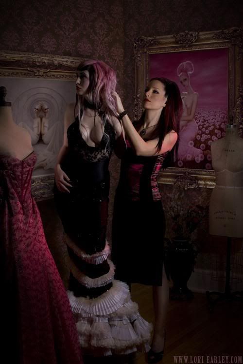 |
|
|
|
Post by COOPER COLE on Dec 6, 2008 12:32:10 GMT -8
Personally I would go with the darker frame, but that entirely depends on what your decor looks like. Although, I do like the look of the lighter molding better (just not a fan of the color)
|
|
|
|
Post by svenman on Dec 6, 2008 12:38:46 GMT -8
i'd go for the darker one too. the image is a very strong colour, so i think the cream would just look a bit lost against the image.
if your going for a very sculptural frame like that, the black one just dominates the set up a bit more and challenges the strength of the image.
lori is stunningly beautiful in those pics.
|
|
|
|
Post by virtu on Dec 6, 2008 12:38:48 GMT -8
Black makes the colors look richer. Cream washes it out and there is no cream in the piece so it does not match  The black one is my choice, you can always paint the cream one black then varnish it. |
|
|
|
Post by masao626 on Dec 6, 2008 12:58:21 GMT -8
i see where you guys are going - i think Lori's picture (the one where she's seated) is the best frame in that it seems to pick up on the darkness beneath the dandilions. i was leaning towards the cream because of this piece below - but you're right, the wish is MUCH stronger in color. hmmmmm....things to think about   |
|
|
|
Post by StephenW on Dec 8, 2008 23:37:53 GMT -8
I'm actually a fan on the creamy frame. While I certainly agree that the darker frame really brings out the color in the piece due to the stark contrast in colors, I feel it also hampers the piece at the same time by completely enveloping the sky and open field within the context of the frame. The dark color causes the piece to "stop" at the edges. With the creamy frame, it evokes the feeling that the sky and the field go on forever and transcends the borders of the piece, which is what really makes this piece lovely to begin with. On another note, why the pastie? We're all adults here.  |
|
|
|
Post by lowpro on Dec 9, 2008 1:11:44 GMT -8
Ok, I can play too. Much like Charity, please excuse the not so great mockups. Twas the best that I could do. And yes, the bottom and top of the piece is lopped off a bit so that I could fit it into the provided space in some fashion.    From day one, I thought a nice subtle silver moulding would work best. I have no interest in using a entirely gold frame, however dark it could be. So I thought the black and gold worked well. I almost think the all black moulding with the gold liner looks the best....in these small images at least. Unfortunately, the piece is 24x36 and I think an entirely black frame will get lost in the grand dimensions. Hence, I think I want to trust my instincts and go with the silver, despite it costing $100 more. Thoughts? |
|
|
|
Post by StephenW on Dec 9, 2008 1:16:17 GMT -8
Silver all the way. It looks fantastic!
|
|
|
|
Post by svenman on Dec 9, 2008 1:33:47 GMT -8
Silver all the way. It looks fantastic! yup! |
|
|
|
Post by masao626 on Dec 9, 2008 4:40:24 GMT -8
On another note, why the pastie? We're all adults here. LOL! it was meant to tantalize - haven't you heard that the suggestion of nudity is often more seductive than actual nudity?? (c'mon, admit to being slightly tantalized!  actually, photobucket was giving me a hard time previously so this was my compromise - woo hoo! walt - much like my own choices, i'm torn between the dark at the top and the silver at the bottom. i don't know that i'm in love with the gold band however on the first frame...hmmm. i'd probably go with the darker frame though. i think. |
|
|
|
Post by steveinca on Dec 9, 2008 12:18:54 GMT -8
I had no idea Lori Earley was so hotttt! Man, what a catch that one would be.
|
|
|
|
Post by Mount Franklin on Dec 19, 2008 23:31:11 GMT -8
I had no idea Lori Earley was so hotttt! Man, what a catch that one would be. Lori Earley  *gulp ... i'm sold. I much prefer the creamy frame btw. The darker tends to wash it out a bit for me. |
|
ill
Full Member

Posts: 158
|
Post by ill on Dec 20, 2008 6:04:03 GMT -8
Lowpro... the silver is the best. The way I see it though, the original's frame was pretty much perfect so myself I'm trying to find an ornate dark bronze color.
|
|
|
|
Post by juggernut3 on Dec 20, 2008 10:41:49 GMT -8
For the Lori Early. I like the Cream. Its already a very vibrant piece. Black may highlight the colors a little to much... unless you want utter pink saturation... then go with the black. But the cream compliments the stunning sharp colors.
For the Simkins... silver gives it that antique-y feel that goes along with the classic simkins theme.
|
|
|
|
Post by highbrow on Dec 20, 2008 22:17:06 GMT -8
Dont know if this is the right place, however this is everything framing. Anyway I am in Atlanta are framing places seem to be few and far between with the exception of Michaels, and other large box stores ( arrons, binders, etc. ) Normally most things I purchase are framed ( or I do not frame them ) anyway I have a large image that needs to be framed but would like a rough price from people who know framing or have had things framed.
Image size is 33X40
Frame black wood 1.5inch wide, 1.5inch deep
floated on archival board
1 inch spacers
archival hinges
now not sure glass or plex, glass will make alot heavier but plexi will be cheaper ( I assume ) any ideas so I do not get taken for a ride as I do not trust a Michaels for framing.
|
|
|
|
Post by amin on Dec 20, 2008 23:27:48 GMT -8
Hey Highbrow, it's too bad you didn't ask about a year ago as my dad owned a framing store in Buckhead. I would take it to a mom and pop shop instead of a chain. A chain store (michael's, great frame up, etc.) have to pay royalties and overhead and guess who has to pay for it? You. Support your local businesses...especially in these times.
Plexiglass isn't necessarily cheaper especially if you get UV, non-glare, etc.
Prices vary depending on the quality of the moulding but, you this sounds like about a $500 - $800 job.
|
|
|
|
Post by highbrow on Dec 20, 2008 23:51:33 GMT -8
Dam you amin I have found 3 local mom and pop shops and am going to price them tomorrow. I have a condo in Buckhead would have loved to support your dad ( does he have any interest in a one time frame job ?) Thanks I was up in the air about the box stores ( michaels usually has 50percent off deals ) Thanks again i figured that would be my price range
|
|
|
|
Post by lowpro on Dec 21, 2008 23:06:34 GMT -8
Lowpro... the silver is the best. The way I see it though, the original's frame was pretty much perfect so myself I'm trying to find an ornate dark bronze color. Personally, I was none too fond of the mouldings chosen, and especially the lack of variety thereof, for this show. The moulding placed on Knight Watch, along with the piece I grabbed from the show, just didn't do it for me. So I definitely wanted to go with a finished corner frame. I was, however, mocking these up well before I had seen what the original was done up in. If you wanted something in the antiqued dark bronze tip, you should look into JFM's 730 series. That's what I did up the It Wanders giclee in and it looks beyond phenomenal...which you can see a couple images of in the Artwork On Display thread. I was tempted to use the same moulding cause I loved it so damn much, but this piece definitely screams for some antiqued silver. Moreover, it is finally in dimensions that allow the purchase of a ready-made JFM frame with nicely done up finished corners. And to answer a couple PM's about the three moulding mockups that I posted above, they're all JFM ready-made frames. JFM easily produces some of the finest mouldings in the game. And with some very simple google searching, you can dig up a couple online retailers that offer them on the cheap, in some cases just above wholesale pricing. I don't have my computer handy, so I can't link to the exact retailer I've found with by far the cheapest prices. But there are a couple out there. I think the silver one I posted was going to come out to just over $300 shipped, which is super cheap for such a nice moulding that is that big (24x36). The others, which were equally nice imo, were more along the lines of low $200s. |
|
ill
Full Member
Posts: 158
|
Post by ill on Dec 22, 2008 5:24:30 GMT -8
Thanks for the heads up on the mouldings. I am curious though. Do you do anything to keep the edge (or rather the lip on the front) of the frame from touching the canvas print or just leave it as is? I'd worry that that is something that might start to harm the print over the years, but I've never had a canvas giclee to frame before.
I guess I never paid much attention to how any originals I have are framed... do I keep it in with glazing points like I would a print or...?
|
|
|
|
Post by virtu on Dec 22, 2008 7:47:31 GMT -8
I always have my framer leave an 1/8 of an inch of border around the image when stretching.
This keeps the lip off it and shows all of the image.
|
|
|
|
Post by gildoinc on Sept 6, 2009 0:22:22 GMT -8
It's been a long time since anyone has posted in this thread and I was hoping we could revisit some of the better framers in LA: Who are you guys using? Any recommendations? Anyones quality go down, etc?
I have great people in NY if anyone ever needs any recommendations.
|
|
|
|
Post by |peetov| on Dec 28, 2009 18:46:12 GMT -8
is there a standard protocol for framing prints? mat/no mat, etc
i'm not a big fan of the white border that typically surrounds the images. if i used a mat i wasn't sure if i needed to go around this or if i could put the mat over the border, etc. i'm pretty sure i'd rather just have the image shown but i wasn't sure if there were reasons to not do this or if it's just all preference. thanks for any input. i've never framed anything before.
|
|
|
|
Post by oldfartatplay on Dec 29, 2009 6:18:32 GMT -8
is there a standard protocol for framing prints? mat/no mat, etc i'm not a big fan of the white border that typically surrounds the images. if i used a mat i wasn't sure if i needed to go around this or if i could put the mat over the border, etc. i'm pretty sure i'd rather just have the image shown but i wasn't sure if there were reasons to not do this or if it's just all preference. thanks for any input. i've never framed anything before. The artist usually signs in the border so if you want the signature/# to show frame it that way, that's what most people do. Some prints don't really have a border (see some Josh Keyes for example) and have deckled edges, lots of people prefer to "float" these prints to show that. Bottom line is what ever you prefer. Just make sure you use a good framer. I've heard lots of horror stories about bad framers trimming prints to fit into frames and such. |
|
|
|
Post by sleepboy on Dec 29, 2009 8:20:17 GMT -8
Yes, also consider the if you matte it, most likely after a while, there will be a color difference (aka discoloration) between the matted and unmatted surface which may make it difficult to ever display it un-matted again or sell it perhaps...
|
|
|
|
Post by epicfai on Jan 11, 2010 17:35:58 GMT -8
newb question regarding framing:
when framing OGs does anyone ever cover the piece in acrylic or glass to help protect it from UV damage? was thinking about a piece in the 25x25 size range... or does it just detract too much from the image? thoughts?
|
|


 *gulp ... i'm sold.