|
|
Post by thinkspace on Jul 8, 2009 13:34:13 GMT -8
I will also add and second what Sven said in that I don't think anyone here is really out to attack this show, it just has spawned a nice thread of discussion as this show is a highlight of the LA art season and brings thousands of new fans to this scene via the attention that the show will get all over the blogosphere and beyond, and something like that can not be measured. This show and others like it do serve as a gateway to the artists within our scene and from there, as Amanda put it, it's up to the collector to search out what catches their eye, and not what they feel they should like via the buzz on boards or such, and trust what they like and if things take off, great, but at day's end you should buy what you love and not worry about a piece you bought as short as six months later and wondering if that artist's career is over and if you should flip the piece or not. That's so short sighted I can't even grasp it to be honest.
"Buy what you love, and buy it early." - commandax (words to COLLECT by)
|
|
|
|
Post by commandax on Jul 11, 2009 9:25:29 GMT -8
Blown away by Kelly Vivanco's two contributions to the show... You would never know she was wedged in between two big shows two months apart! "Charles De Mar"  "This is pure snow! Do you have any idea what the street value of this "This is pure snow! Do you have any idea what the street value of this
mountain is?""Excuse me – I believe you have my stapler."  "And I said, I don't care if they lay me off either, because I told, I told Bill that if they move my desk one more time, then, then I'm, I'm quitting, I'm going to quit. And, and I told Don too, because they've moved my desk four times already this year, and I used to be over by the window, and I could see the squirrels, and they were married, but then, they switched from the Swingline to the Boston stapler, but I kept my Swingline stapler because it didn't bind up as much, and I kept the staples for the Swingline stapler and it's not okay because if they take my stapler then I'll set the building on fire... " "And I said, I don't care if they lay me off either, because I told, I told Bill that if they move my desk one more time, then, then I'm, I'm quitting, I'm going to quit. And, and I told Don too, because they've moved my desk four times already this year, and I used to be over by the window, and I could see the squirrels, and they were married, but then, they switched from the Swingline to the Boston stapler, but I kept my Swingline stapler because it didn't bind up as much, and I kept the staples for the Swingline stapler and it's not okay because if they take my stapler then I'll set the building on fire... " |
|
|
|
Post by sleepboy on Jul 11, 2009 10:09:25 GMT -8
|
|
ck
Full Member

Posts: 189
|
Post by ck on Jul 11, 2009 12:45:27 GMT -8
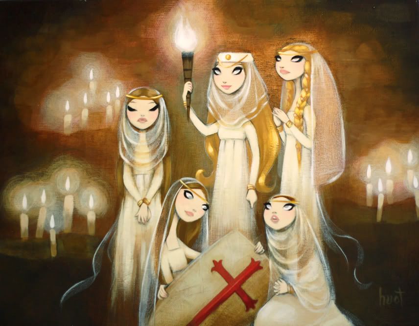
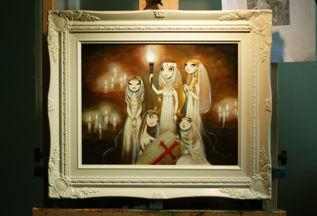
what a beautiful huot piece! i love the glow....can't figure out which movie it's supposed to portray though.
|
|
|
|
Post by virtu on Jul 11, 2009 13:32:55 GMT -8
what a beautiful huot piece! i love the glow....can't figure out which movie it's supposed to portray though. Monty Python and The Holy Grail It really is breathtaking. Congratulations to whomever scores this Huot. |
|
|
|
Post by travislouie on Jul 13, 2009 5:49:38 GMT -8
I stopped by the gallery to sign some prints and got a sneak peek at the show. There's some really nice work there.
definitely worth a look!
|
|
|
|
Post by thinkspace on Jul 13, 2009 10:28:15 GMT -8
WAIT to you all see the collaboration piece between Amy Sol and Craola. REALLY nice.
So far, Kelly's stapler piece steals the show for me. Was by there on Saturday afternoon myself, and the show's got some strong pieces in it for sure.
|
|
|
|
Post by sleepboy on Jul 14, 2009 9:28:09 GMT -8
Dope 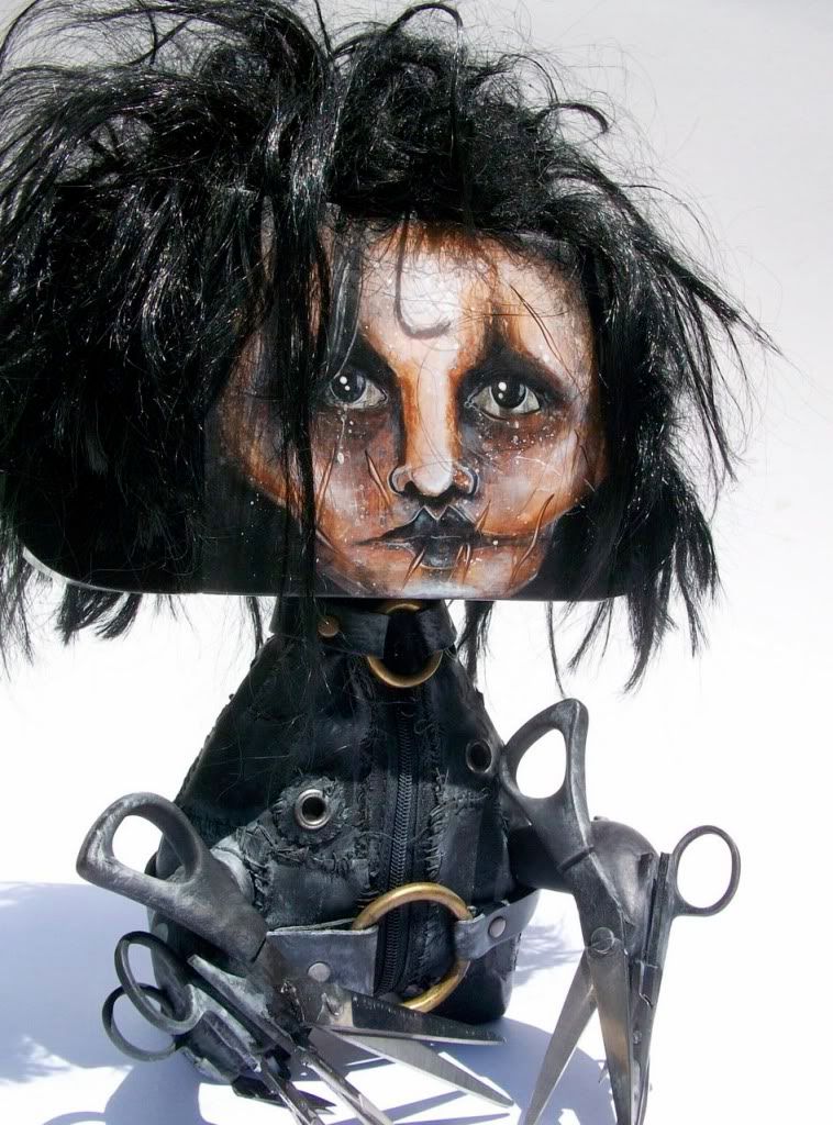 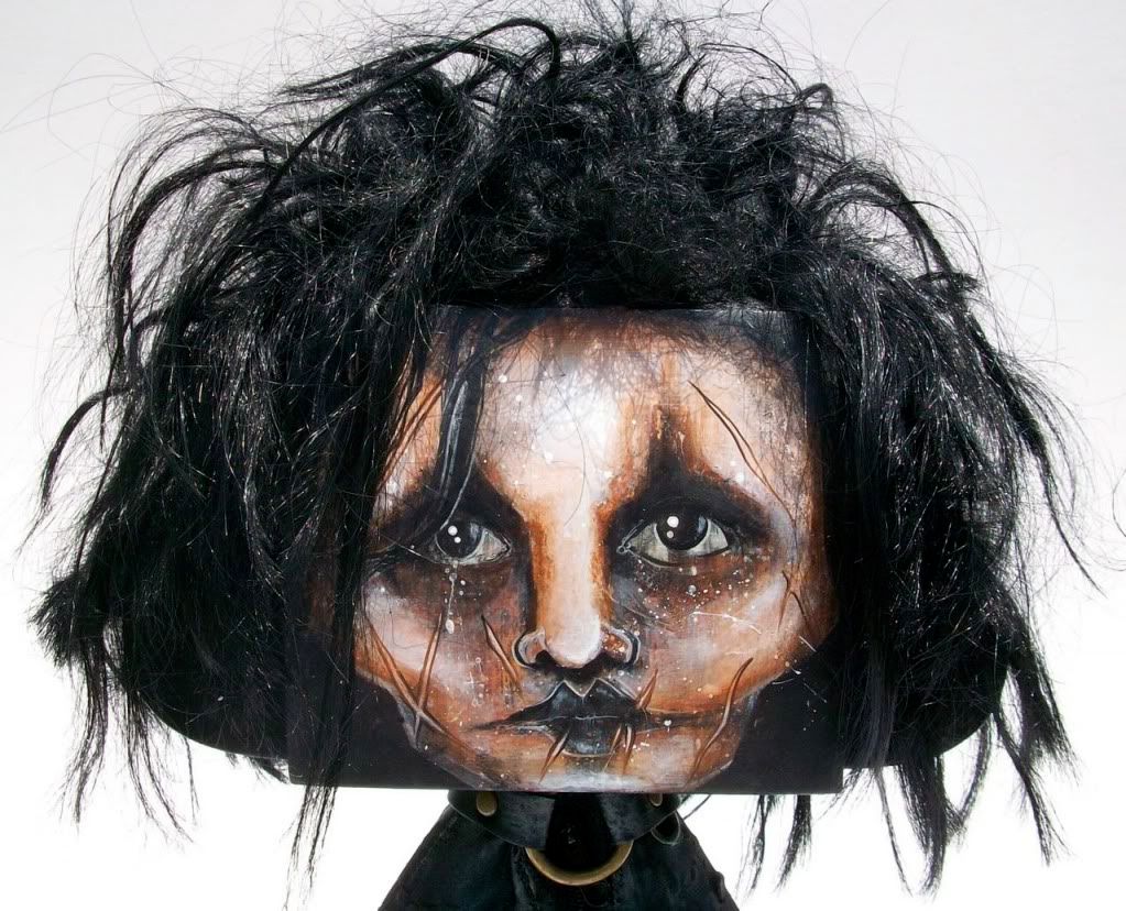 |
|
|
|
Post by thecreep on Jul 14, 2009 10:28:07 GMT -8
Here is Dave MacDowell's painting for the show. The colors, the idea are all amazing. I know he wanted to work on something based on Robert Williams painting, but never knew it would be this cool. 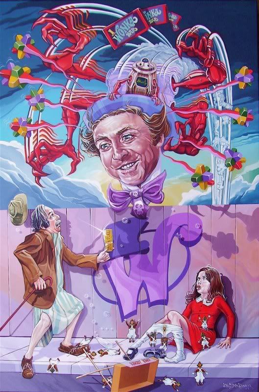 |
|
|
|
Post by lowpro on Jul 14, 2009 12:39:42 GMT -8
WAIT to you all see the collaboration piece between Amy Sol and Craola. REALLY nice. Talk about polar opposites in styles...or at least in terms of color palettes and the differences in a hard and soft approach. Quite intriguing. |
|
|
|
Post by sleepboy on Jul 14, 2009 15:29:30 GMT -8
WAIT to you all see the collaboration piece between Amy Sol and Craola. REALLY nice. Talk about polar opposites in styles...or at least in terms of color palettes and the differences in a hard and soft approach. Quite intriguing. 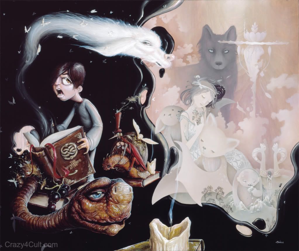 Here it is, along with a bunch of other images here. I guess it's not so sure that Weird Al will be there anymore. |
|
|
|
Post by jakewaldron on Jul 14, 2009 18:21:11 GMT -8
Morla looks awesome there. Such a great movie.
|
|
|
|
Post by lowpro on Jul 14, 2009 19:15:58 GMT -8
Morla looks awesome there. He really does. All in all, it's a reasonably successful collaborative painting. Most fall flat on their face. This one works sufficiently well. My one qualm with the piece, from a purely diehard Neverending Story fan perspective, is Amy's rendering of the Wolf. There's certainly no rules for something like this, so it's not imperative for the characters to be direct representations of their on-screen personalities. But for me, as a kid growing up watching this film every other day, there was nothing more terrifying than the Wolf character. From the close up imagery of his eyes hidden in the brush hunting Atreyu and crew on their quest to save the Empress to the crazy climactic battle - riff with especially foreboding and intimidating dialogue by the Wolf - to the death, that fucker scared the shit out of me. There was nothing cute about the Wolf. It is befitting of her style, though. Perhaps Greg should've taken the Wolf and Amy rendered Falkor. {{insert lame comments about above post and recollection of names et al}} |
|
|
|
Post by jakewaldron on Jul 14, 2009 20:05:50 GMT -8
Yeah I thought so too. Seeing the Gmork in the calm/peaceful looking side is kind of weird. It does help to tie it all together though. Otherwise it would be pretty much split down the center dark and light.
I've gotta say though, Falkor always scared me way more than Gmork. And there is absolutely nothing lame about knowing all that right off the top of your head. Haha.
|
|
|
|
Post by lowpro on Jul 14, 2009 21:13:43 GMT -8
Ha. Clearly I was so petrified by the wolf that I couldn't even learn or recall his name.
The scariest thing about the painting itself is the kid's (Bastion) face.
|
|
|
|
Post by steveinca on Jul 15, 2009 9:22:26 GMT -8
anyone have a link to the preview?
|
|
|
|
Post by svenman on Jul 15, 2009 12:28:57 GMT -8
the mcdowell piece looks great.
good to see his wit coming through in this piece. he really has the skills too.
but that crayola / sol 'collaboration'? seriously?
it just looks like 2 polar opposite artists have painted on the same canvas - doesn't seem to to have any 'collaborative' elements at all for me. like mixing ice cream with gravy. ugh.
props to them for trying it out, but i really don't think this works at all.
|
|
|
|
Post by thecreep on Jul 15, 2009 13:06:36 GMT -8
Edit: I have been able to see some of the works, those of which have been posted around the net, on social networking sites and the lucky few that people have shared with me via e-mail.
|
|
|
|
Post by thecreep on Jul 15, 2009 13:14:12 GMT -8
but that crayola / sol 'collaboration'? seriously? it just looks like 2 polar opposite artists have painted on the same canvas - doesn't seem to to have any 'collaborative' elements at all for me. like mixing ice cream with gravy. ugh. props to them for trying it out, but i really don't think this works at all. When I first heard of the collaboration I was thinking about something like the Baby Tattooville collab pieces, intertwining and occupying similar spaces. I love the work of both of these artists, but to me this looks more like a show card. I feel like its hyping me up for a future exhibition of these artists. |
|
|
|
Post by evilchoy on Jul 15, 2009 13:29:15 GMT -8
the Ryohei Hase piece is insane
|
|
|
|
Post by svenman on Jul 15, 2009 13:40:08 GMT -8
funny you say it looks like a show card josh... i was thinking the same thing - almost like 2 individual paintings photoshopped together.
|
|
|
|
Post by sleepboy on Jul 15, 2009 14:36:51 GMT -8
the Ryohei Hase piece is insane Ooh, I would like to see that one. Here's Lola's from Willy Wonka methinks. 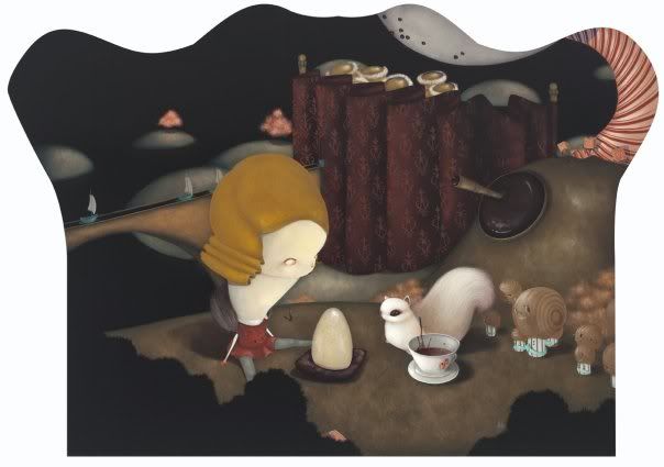 |
|
|
|
Post by steveinca on Jul 15, 2009 15:19:07 GMT -8
Preview is up on blog......that Eric Fortune piece is a steal. 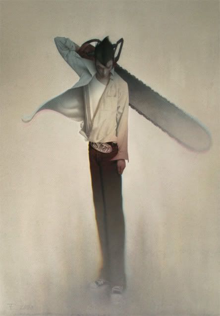 |
|
|
|
Post by evilchoy on Jul 15, 2009 15:49:49 GMT -8
|
|
|
|
Post by steveinca on Jul 15, 2009 17:14:19 GMT -8
For some reason i can't access the blog/preview anymore......weird.
|
|