|
|
Post by cpk on Oct 26, 2011 16:01:21 GMT -8
the sword also looks rather phallic. bothers me This piece is clearly a feminist statement, combined with an anti-consumerist stance. It actually reminded me of Princess Peach from Mario striking Link's classic pose. I figured it was for g1988's next video game themed show. |
|
|
|
Post by sleepboy on Oct 26, 2011 20:01:08 GMT -8
Lols, the show is about re-interpreting childhood drawings I think although i don't know if that is Audrey's drawing.
|
|
|
|
Post by sleepboy on Nov 6, 2011 8:58:07 GMT -8
Finished piece for the Homeroom show ( showthread here). Guess what she was holding was supposed to be a sword   |
|
|
|
Post by cpk on Nov 6, 2011 12:49:51 GMT -8
wow... not a fan of this work at all. I am with you on this one-I don't like the sharp, angled face with that expression- I love her softer faces with expressive eyes, more like the ones seen at In the Wake of Dreams show. |
|
xpc
Full Member
  
Posts: 184
|
Post by xpc on Nov 6, 2011 12:59:45 GMT -8
Am I the only one to think she's not progressing as an artist?
|
|
|
|
Post by epicfai on Nov 6, 2011 13:22:37 GMT -8
Am I the only one to think she's not progressing as an artist? i hear you on this. i sold my kawasaki painting a while back as i had lost interest in her work. i think her work is just too predictable. sure she adds new patterns and such to the backgrounds but in essence it has proven to be very repetitive and somewhat trite. i think her best period of work was ~2006 when it was more fresh. that said, occasionally i will see something that i like. |
|
|
|
Post by comiconart on Nov 6, 2011 13:40:38 GMT -8
Agreed. While her technical skills have improved, her development as an artist has been stagnant for quite awhile. Sad, really. She seems far too content to keep churning out the same pretty pictures rather than challenging herself to evolve.
|
|
|
|
Post by Chop-Logik on Nov 6, 2011 16:05:11 GMT -8
[...]Sad, really. She seems far too content to keep churning out the same pretty pictures rather than challenging herself to evolve. Just curious, what would you consider a step forward in Kawasaki's evolution? Different mediums, size, subject matter? |
|
|
|
Post by comiconart on Nov 7, 2011 9:09:58 GMT -8
Different subject matter, different technique...basically, anything that shows an effort at growth/change. We know she can paint pretty young half-naked girls. And...the backgrounds get nicer and more intricate. But...is there anything else...?
I thought she was making an effort to evolve with the Mondo Bizzaro show in Rome back in '08 (I think?). The monochromatic nature of those pieces was a nice change, the backgrounds were a bit more loose (chaotic and energetic)...it seemed like she was "letting go" a bit, and going in a new direction.
Unfortunately, that lasted all of one show, and then she was right back where she started again (and has been ever since).
|
|
|
|
Post by cpk on Nov 7, 2011 13:29:31 GMT -8
I guess I don't mind if artists stick with there niche's... It's just that I like all her work from 2009 and earlier much better than anything she has produced since. It's hard to describe in words, but I can just tell you that I haven't loved a painting since 2009, and I loved a lot more from 2008. I also don't mind if she sticks with the pretty girls but for me there is a lack of purpose, feeling and motivation. I can feel the longing, sexuality, etc in some of Audrey's previous works and now it feels like the girls are devoid. I also like ealier works that had a sense of movement to them. I'd like to see more work that evoked emotion rather than pretty for pretty's sake. |
|
|
|
Post by sleepboy on Dec 5, 2011 17:44:18 GMT -8
congrats to her on the new cover. 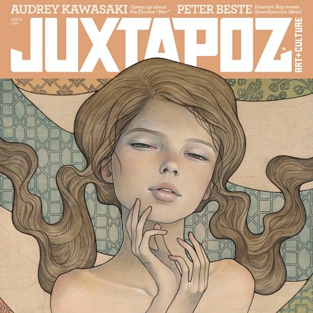 |
|
|
|
Post by sleepboy on Dec 7, 2011 16:15:31 GMT -8
A shot for the issue. 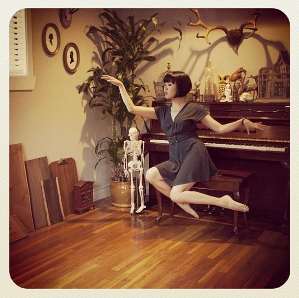 |
|
|
|
Post by sleepboy on Dec 21, 2011 21:21:56 GMT -8
Doodling. 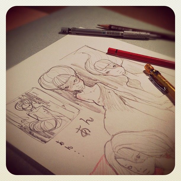 |
|
|
|
Post by sleepboy on Dec 29, 2011 21:38:00 GMT -8
iPad drawing on her new device. 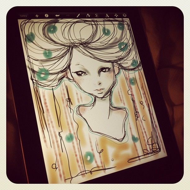 |
|
|
|
Post by sleepboy on Jan 28, 2012 5:16:14 GMT -8
|
|
|
|
Post by sleepboy on Feb 3, 2012 23:20:35 GMT -8
Side project was for Hint Mint. 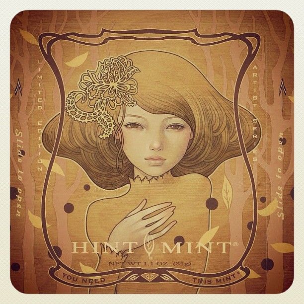 |
|
|
|
Post by thumbprintgallery on Feb 4, 2012 13:56:13 GMT -8
One of my favorites. I see here everywhere lately too.
|
|
|
|
Post by sleepboy on Feb 8, 2012 19:18:46 GMT -8
Another variant. 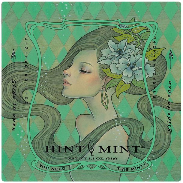 |
|
|
|
Post by cpk on Feb 8, 2012 23:38:41 GMT -8
Another variant.  I do like the colors. The hair (I love the hair) against that green background and the blue flowers-very pretty. |
|
|
|
Post by sleepboy on Feb 11, 2012 22:06:22 GMT -8
Peek at two layer piece for charity. 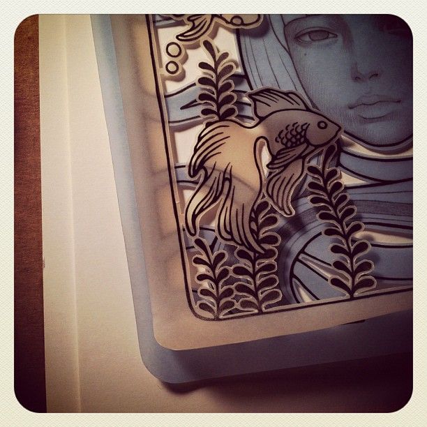 |
|
|
|
Post by twocool4u1 on Feb 13, 2012 8:13:53 GMT -8
|
|
|
|
Post by sleepboy on Feb 14, 2012 23:36:02 GMT -8
Another. 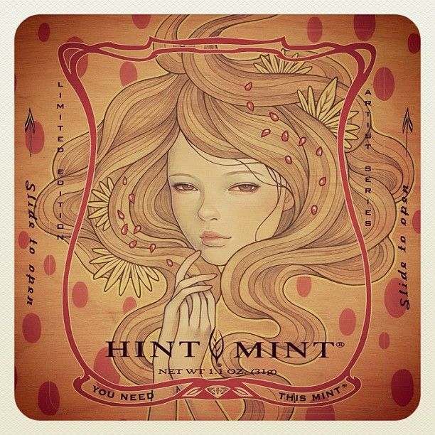 |
|
|
|
Post by sleepboy on Feb 16, 2012 12:52:25 GMT -8
|
|
|
|
Post by sleepboy on Apr 7, 2012 16:46:40 GMT -8
Work in progress... 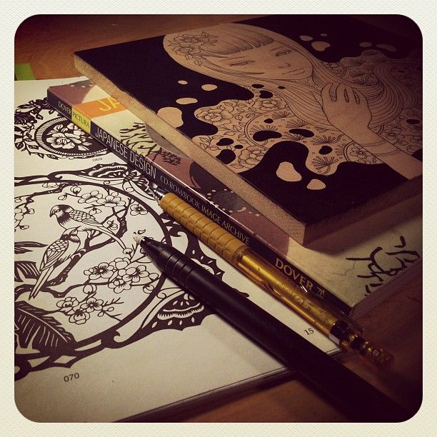 |
|
|
|
Post by sleepboy on Apr 22, 2012 15:52:22 GMT -8
a look inside her studio... 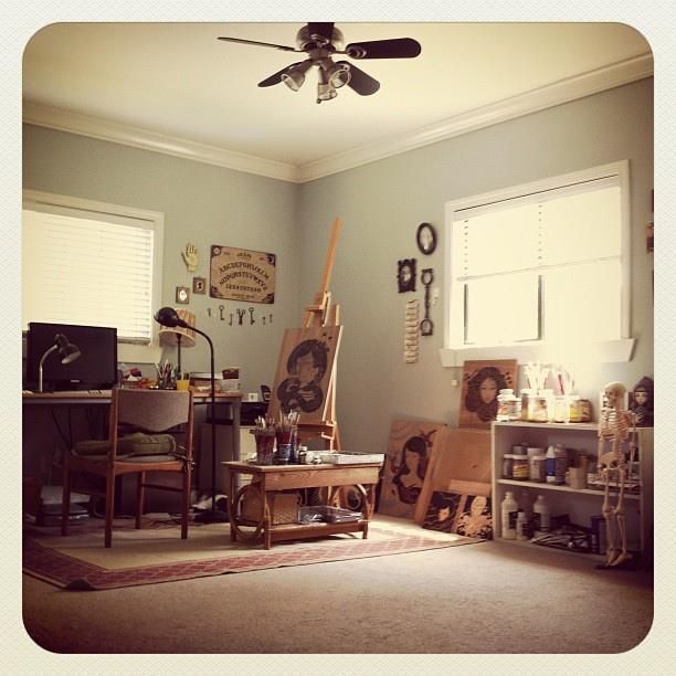 |
|