|
|
Post by sin on Feb 6, 2013 12:47:49 GMT -8
the preview is out. anyone have it? would you be so kind as to share it with me?
thank you
|
|
|
|
Post by svenman on Feb 6, 2013 14:43:28 GMT -8
just emailed you craig.
|
|
|
|
Post by sin on Feb 6, 2013 15:08:11 GMT -8
Thanks guys. Would have replied earlier but needed to pick myself up off the floor both for the quality of the canvas works and the prices  |
|
|
|
Post by hellosir on Feb 7, 2013 6:36:00 GMT -8
the preview is out. anyone have it? would you be so kind as to share it with me? thank you Next in line please. |
|
|
|
Post by volvic on Feb 7, 2013 13:16:41 GMT -8
|
|
|
|
Post by origo on Feb 7, 2013 14:09:30 GMT -8
Thanks for the pictures.
I must admit that I have seen pieces in members collections and older pieces in general that I think are much stronger than these, really think it's a weak body of work.
Same technique, but with a weird mashup of colours.
|
|
|
|
Post by ricosg11 on Feb 7, 2013 14:35:44 GMT -8
I disagree. He comes from tagging, his work is always going to be in this vein. I see a lot of growth and risk here. Mixed results? Sure, but you have to respect leaving the comfort zone a bit. The pink "Kapoor" type piece falls a little flat for me, but I think it is a very interesting direction to explore and could lead to some lovely results.
Im not sure why, but for me these paintings have a dream like hue to them.
|
|
|
|
Post by drevil on Feb 7, 2013 14:40:20 GMT -8
This work is somewhat different than I have seen him produce in the past. And he is taking steps in different directions here than he has before. Good for him.
But I see this body of work as a whole as fairly weak. Devolving rather than evolving. Meh for me.
|
|
|
|
Post by harveyn on Feb 7, 2013 14:42:31 GMT -8
Thanks for the images Volvic. I for one think this show looks particularly strong and absolutely love his movement into these more vivid colours. I love both the colour palette and composition. I am in love!!!!!  |
|
|
|
Post by bmerel on Feb 7, 2013 16:44:38 GMT -8
This work is somewhat different than I have seen him produce in the past. And he is taking steps in different directions here than he has before. Good for him. But I see this body of work as a whole as fairly weak. Devolving rather than evolving. Meh for me. i happen to agree with you. theres a few very nice looking pieces but most look bland and lacking any sort of depth, especially his paper work. just my opinion. very curious of the prices though if anyone knows em... want to see how many new cars each one cost... |
|
|
|
Post by sin on Feb 7, 2013 17:16:17 GMT -8
60K - 125K for the canvas works
8K on most if not all of the paper works.
I think the paper works are weak as others have mentioned.
I love the canvas works. There are no quantum leaps here but I especially love a few of these. Thank you for sharing the pictures.
|
|
|
|
Post by waltercrunk on Feb 7, 2013 18:18:00 GMT -8
I for one think this show looks particularly strong and absolutely love his movement into these more vivid colours. I love both the colour palette and composition. I am in love!!!!! I have to agree with Harveyn. I like this direction and would love to see more. Im quite fond of this paper piece, though I do think $8k is a bit over the top.  |
|
|
|
Post by svenman on Feb 8, 2013 1:14:40 GMT -8
really enjoyed the show...
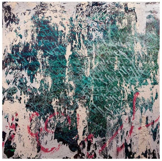
nice to see a body of work in the uk again, and a nice progression since his last uk show at elms back in what, 2008? that show was more heavily calligraphic, whereas this show was more about capturing texture and embracing the power of surface. there was still a heavy amount of his quite unique mark making / writing style evident throughout the work, but i thought that that this show was a journey further into abstraction than before.
the pink 'kapoor' piece referred to above was quite stunning, but the installation in the front room was probably my favourite element. good to see and enjoy the scale of that.
when i first saw the pdf, i brushed over it quickly, and dismissed the paper pieces almost immediately. however seeing the paper pieces in context with the other works really allied these elements with the canvas work - there are effectively process driven mono-prints taken straight off the canvases.
as usual, pictures don't do the work justice. if you can go see it for yourself, you really should.
|
|
|
|
Post by volvic on Feb 8, 2013 6:39:25 GMT -8
I have to say it was quite interesting seeing paul and fiona from elms there, they seemed quite lost and intimidated for some reason. Well paul did anyhow.
|
|
|
|
Post by hellosir on Feb 8, 2013 6:48:35 GMT -8
I have to agree with both Ricosg and harvey. he is definitely trying something new. Thinking back to interviews and how he talks about building up texture the same way a city wall does, it feels like he is trying to incorporate the new aspect of the city/private sector involved in creating a new wallscape by building it up with texture and then going over it with a more solid texture rather than just the script/tagged/paper covered wall. As a whole I am excited to see how much further he goes with this even though some pieces may not have hit the mark.
Any chance people got detail/zooms of the pink or aqua pieces?
|
|
|
|
Post by afr1ka on Feb 8, 2013 7:55:45 GMT -8
I really love the new Canvas pieces for this show. The collage pieces are superb and I think the colors that are being used are gorgeous.
Unfortunately I think the paper works are very weak. One of the things I always liked about the older pieces on paper was that there was a clear difference between them and the canvas pieces.
I feel like these are trying to hard to be a canvas piece and the effect on paper is just not the same.
|
|
|
|
Post by drevil on Feb 9, 2013 5:08:24 GMT -8
Thanks for the images Volvic. I for one think this show looks particularly strong and absolutely love his movement into these more vivid colours. I love both the colour palette and composition. I am in love!!!!!  To me this is one problematic aspect and one of the reasons I characterized this as a devolution. My understanding is that one of his core tenets is the reproduction of urban city walls showing the layering of graffiti, flyers, etc over time. To my eye his older work does a much better job of capturing this concept. When was the last time you saw urban city walls that are sky blue? Those are my favorite canvases. However I like them as pretty paintings rather than conceptually strong works. They look nothing like a city wall. It seems to me these colors are likely being pursued to produce a more saleable product that appeals to people who don't really want much conceptual depth in their art (though they would never recognize this in themselves). I have not read anything to that undermines this hunch. |
|
|
|
Post by ricosg11 on Feb 9, 2013 5:54:28 GMT -8
Thanks for the images Volvic. I for one think this show looks particularly strong and absolutely love his movement into these more vivid colours. I love both the colour palette and composition. I am in love!!!!!  To me this is one problematic aspect and one of the reasons I characterized this as a devolution. My understanding is that one of his core tenets is the reproduction of urban city walls showing the layering of graffiti, flyers, etc over time. To my eye his older work does a much better job of capturing this concept. When was the last time you saw urban city walls that are sky blue? Those are my favorite canvases. However I like them as pretty paintings rather than conceptually strong works. They look nothing like a city wall. It seems to me these colors are likely being pursued to produce a more saleable product that appeals to people who don't really want much conceptual depth in their art (though they would never recognize this in themselves). I have not read anything to that undermines this hunch. In the last few years Jose has done a lot of traveling outside of major cities. In fact, he has visited jungles, oceans and mountains. I believe this is where the inspiration for added colors comes from. Turning them more towards representations of landscape paintings than urban decay. |
|
|
|
Post by harveyn on Feb 9, 2013 7:26:18 GMT -8
I see these latest works as a less literal interpretation of urban decay and a naturally evolution of his work. Both styles for me equally beguiling and equally beautiful.
|
|
|
|
Post by drevil on Feb 9, 2013 8:09:28 GMT -8
To me this is one problematic aspect and one of the reasons I characterized this as a devolution. My understanding is that one of his core tenets is the reproduction of urban city walls showing the layering of graffiti, flyers, etc over time. To my eye his older work does a much better job of capturing this concept. When was the last time you saw urban city walls that are sky blue? Those are my favorite canvases. However I like them as pretty paintings rather than conceptually strong works. They look nothing like a city wall. It seems to me these colors are likely being pursued to produce a more saleable product that appeals to people who don't really want much conceptual depth in their art (though they would never recognize this in themselves). I have not read anything to that undermines this hunch. In the last few years Jose has done a lot of traveling outside of major cities. In fact, he has visited jungles, oceans and mountains. I believe this is where the inspiration for added colors comes from. Turning them more towards representations of landscape paintings than urban decay. This would make the situation even worse, if true. IMO. Besides I see no evidence of this in the Haunch materials. |
|
|
|
Post by hellosir on Feb 9, 2013 14:35:21 GMT -8
In the last few years Jose has done a lot of traveling outside of major cities. In fact, he has visited jungles, oceans and mountains. I believe this is where the inspiration for added colors comes from. Turning them more towards representations of landscape paintings than urban decay. This would make the situation even worse, if true. IMO. Besides I see no evidence of this in the Haunch materials. My take is that yes Jose is much more aware of the entire city surroundings/environment and feel. He still looks to recreate that urban decay or beauty that he finds organically yet doesn't focus necessarily on just the recreation of a few specific square meters in a massive cityscape but as pieces of inspiration. I think his work in Cuba showed how his work is fitting better and better with the whole environment. To me this body of work reminds me of lots of more classical representations of London. For example he seems to capture alot of the same color tones as Monet did in his Parliament/Waterloo Bridge sunsets. That lighting is timeless and to me shows some progression of his original concept. Again not all are perfect pieces but as a whole I think his vast experience is broadening and expanding his influences toward inspiration. To me, not seeing it live, I'm sure he is still a master at building of different layers of texture in many forms just as he was doing earlier in his career. |
|
|
|
Post by afroken on Feb 9, 2013 15:09:32 GMT -8
I have to agree with the detractors. I love Jose's work but this body of work feels tired and forced, taking it firmly in to the realm of decorative, which he's always skirted around anyway. I've always thought of his work, and the writing, being about story telling but these seem to be about one dimensional image.
|
|
|
|
Post by boppieboy on Feb 11, 2013 9:42:16 GMT -8
I see these latest works as a less literal interpretation of urban decay and a naturally evolution of his work. Both styles for me equally beguiling and equally beautiful. Ah, but is it flippable Neil Harvyen? |
|
|
|
Post by mose on Feb 11, 2013 9:54:39 GMT -8
What would be the negative term for selling at a loss soon after purchase? 'dropping'? 'cutting'? I might be partial to 'letting', as in bloodletting but also nice in that it captures the whole renting aspect of art collecting, as in no one actually buys the work they just rent it for a time.
Using in a sentence: This work is lettable.
|
|
|
|
Post by waltercrunk on Feb 11, 2013 17:29:14 GMT -8
|
|