|
|
Post by epicfai on Feb 4, 2011 11:18:16 GMT -8
look great, happahaoli!
|
|
|
|
Post by shine166 on Feb 24, 2011 10:25:20 GMT -8
|
|
fletch
Junior Member
 
Posts: 78
|
Post by fletch on Mar 1, 2011 12:21:52 GMT -8
I really like this 'in context' thread, as the first post said I find it interesting to see how the works look within the room and in the context of the other pieces of art. I've become more obsessed with this and how clustering artists work can affect what you look at first etc. Anyhow, some stuff in context, starting with my daughters room:  Shrigley's  Barnharts: 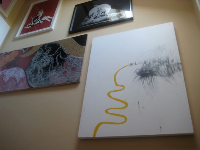 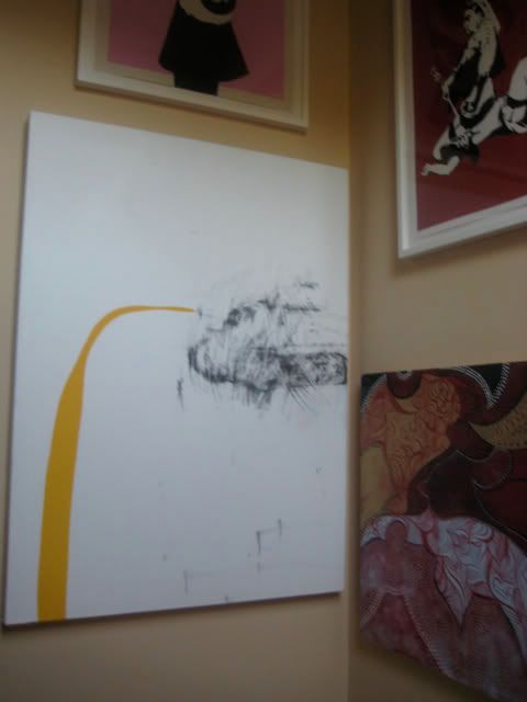 Cut Up Collective: 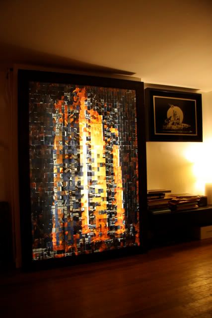 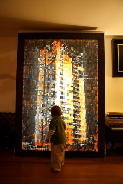 L'Atlas, Koukoudakis and Micallef:  x |
|
|
|
Post by svenman on Mar 1, 2011 13:31:11 GMT -8
the picture of the cut up collective piece is wonderful fletch. i saw some of their lightboxes at the baltic a few years ago. impressive scale, and a lovely piece. do you know what posters they used to make this image? the shrigley collection is fantastic. i really have to get my fucking ace card framed up. yours looks nice and simple and compliments the work well. i may nick that as a framing idea. i'm a big fan of those terrible tinkling tanks too. barnhart is similar to palladino in terms of his constant reinvention and evolution of his style. i've heard him described as an 'artist's artist', and i think that makes sense. i feel good that i'm not the only one who buys art 'for the kids room'  thanks for sharing these. |
|
fletch
Junior Member
 
Posts: 78
|
Post by fletch on Mar 1, 2011 14:15:48 GMT -8
Hey Sven Somewhat fucking brilliantly (in relation to what they literally do) the original Cut Up piece was a Transformers poster: 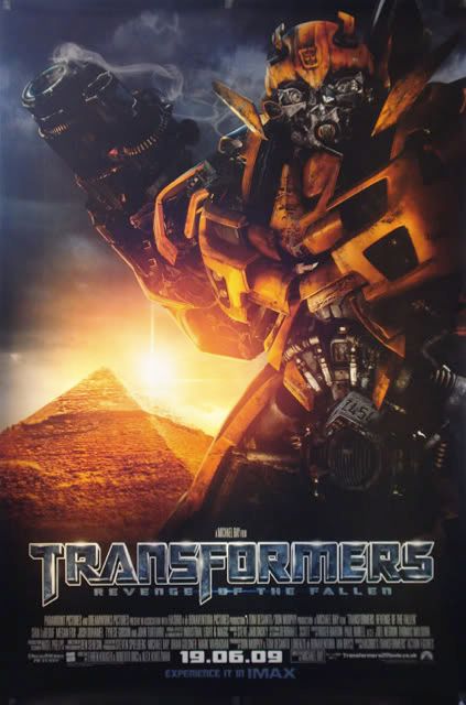 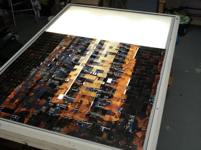 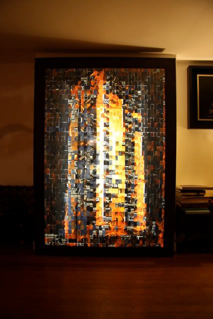 I originally asked for a portrait piece, but upon inspection it was way too dark for the house (although - the portraits are - stunning on the streets) and the building / city piece seemed to work really well. Barnhart: Every now and again I check what he's up to, and it tends, as you say, to be something completely different to what he was doing for the last show. Completely. Cheers |
|
|
|
Post by svenman on Mar 1, 2011 15:33:48 GMT -8
great effect. they made a towering inferno from transformers!
|
|
|
|
Post by chadley on Mar 1, 2011 20:01:53 GMT -8
creating a work of art out of transformers is a truly amazing feat, michael bay would be proud
|
|
|
|
Post by shine166 on Mar 2, 2011 11:22:42 GMT -8
Some great pieces fletch, whats the Shrigley news piece?.. ive never seen that before
|
|
|
|
Post by jediak on Mar 2, 2011 11:35:27 GMT -8
That piece is nuts, thanks for sharing, never seen the work before.
|
|
fletch
Junior Member
 
Posts: 78
|
Post by fletch on Mar 2, 2011 11:43:09 GMT -8
Some great pieces fletch, whats the Shrigley news piece?.. ive never seen that before I bough it a few years ago from Edinburgh print makers, don't know if they have any more www.edinburgh-printmakers.co.uk/hit print, new prints and choose Shrigley from the drop down menu |
|
|
|
Post by |peetov| on Apr 10, 2011 22:39:06 GMT -8
finally got around to hanging some newer stuff poorly  |
|
|
|
Post by epicfai on Apr 10, 2011 23:28:16 GMT -8
thats quite the collection you've got there peetov. very nice man.
|
|
|
|
Post by svenman on Apr 11, 2011 5:52:21 GMT -8
some lovely pieces in that grouping peetov.
i recognise some, but not all. could you elaborate on who's who?
i love the paul barnes piece!
|
|
|
|
Post by rhythmgtr5 on Apr 11, 2011 6:18:12 GMT -8
Nice Geddes, Frizzell and Wittfooth. Very jealous over here  |
|
Jesús
Full Member
  
Posts: 199
|
Post by Jesús on Apr 11, 2011 7:43:25 GMT -8
finally got around to hanging some newer stuff poorly  top to bottom, left to right... -Keyes - Sowers (print) -Paul Barnes 2nd row: - what appears to be a Viner? (50% chance I am wrong) -Wittfooth -Tran Nguyen, and underneath Nguyen: - (unknown, have no idea?; the very obscure/dark one, next to wittfooth)last five pieces (3rd and 4th rows): -Berens -Geddes -Yoskay Yamamoto? -Frizzell -Sylvia Ji Is that a projector/screen next to the Ji?  great collection... |
|
|
|
Post by |peetov| on Apr 11, 2011 8:06:10 GMT -8
some lovely pieces in that grouping peetov. i recognise some, but not all. could you elaborate on who's who? i love the paul barnes piece! sure sven, and thanks. most of the pieces have been outed. the floated head above the berens on the left is by sam weber. the darker horizontal piece to the right of the wittfooth and also the large zombie piece under the wittfooth are both jeremy geddes. the orange/blue piece above the sylvia ji piece is by yuta onoda. i can take better pics of any specific pieces if you'd like, but my puppy chewed through my camera cable so it will be a phone shot unfortunately. churdiales, yeah that's a projector screen. i think i meant to put it up but whatever. i live in a tiny studio and everything has to get cozy with everything else. |
|
Jesús
Full Member
  
Posts: 199
|
Post by Jesús on Apr 11, 2011 8:19:49 GMT -8
very nice...
do you have a closer picture of the darker (as in absence of light) geddes?
and onoda, I thought it was Yamamoto... my bad.
great stuff...
|
|
|
|
Post by |peetov| on Apr 11, 2011 8:40:06 GMT -8
sure here's a terrible phone pic i just snapped. it's from an old fighting series that he did. it looks much more detailed than what this picture shows but not nearly as detailed as his newer works. sorry i can't get a better shot for you:  |
|
|
|
Post by rhythmgtr5 on Apr 11, 2011 9:03:15 GMT -8
Very cool. I don't believe I've seen that piece before. That Ji is also quite lovely - one of my favorites from the show.
|
|
|
|
Post by lowpro on Apr 11, 2011 19:53:01 GMT -8
Very nice, Josh. Love the common stylistic thread of the Frizzell, Wittfooth, Ji trifecta. That Wittfooth is so good.
|
|
|
|
Post by Weezy on Apr 11, 2011 22:12:23 GMT -8
I'm particularly awed by the Geddes pieces! They're really wonderful.
Weezy
|
|
|
|
Post by |peetov| on Apr 14, 2011 0:00:50 GMT -8
thanks everyone. weezy, as far the geddes pieces, they are pretty awesome. i have a couple more that i need to get framed properly and get hung. i'm a pretty big fan of his as my geddes themed sleeping corner illustrates:  |
|
|
|
Post by svenman on Apr 14, 2011 12:28:09 GMT -8
this is an enjoyable thread.
nice grouping peetov.
i never paid attention to the size of that cafe print before, much more manageable than i expected. how's that image in the flesh? i still can'r get over that it's not a photo everytime i see it!
|
|
|
|
Post by |peetov| on Apr 14, 2011 14:54:29 GMT -8
the cafe print is *amazing* it's easily one of my favorite pieces from him and the print looks incredible. i can't believe it wasn't selling as well as his other prints, but i think people are more into the cosmonaut themed pieces. it's certainly my favorite print of his to just stare and and marvel at the detail....although i wake up and look at heat death a fair amount also.
|
|
|
|
Post by epicfai on Apr 14, 2011 15:12:20 GMT -8
so thats three geddes originals now? nice work man.
|
|