|
|
Post by afroken on Oct 14, 2011 11:10:48 GMT -8
|
|
|
|
Post by solar77 on Oct 14, 2011 16:41:59 GMT -8
I like this a lot. Thanks for the post!
|
|
avert
Full Member
  
Posts: 179
|
Post by avert on Oct 14, 2011 17:06:55 GMT -8
yeah. refreshingly clean and simple. that cereal box one, is it a painting? love that gallery space too. the show looks great.
|
|
|
|
Post by afroken on Oct 15, 2011 0:02:01 GMT -8
What I like about this guy is the clarity of his vision. If you look at the work as a whole the nostalgia washes over you, which is rather lovely, and I think the found objects and gym mats (which are actually pretty striking when you see them in person) really support that. But there are pieces you can take out of the gallery context that stand on their own two feet conceptually. There is one painting in particular at the London show that isn't dissimilar in its effect on the viewer to an Auerbach Fold painting. I stood in front of it and felt something pretty special. It's very different from any of the above, painted with a fire extinguisher but still with this strange nostalgic warmth.
For what its worth, the photos above are from Lucien's graduation show. He studied at the Cooper Union and I believe that his time with Dan Colen was part of his studies. But the fact that he's producing work of this caliber at 23 years-old can't be ignored.
|
|
|
|
Post by rizza79 on Oct 15, 2011 5:57:16 GMT -8
when I first saw the PDF of this show, I thought it worked well as a whole body of work, but the works didn't do much for me on their own. Personally I need to see a little more than a show about Nostalgia to truly catch my interest. as far as seeing the gym wall pad in person, I can't imagine what difference it would be than seeing the one in my high school gym. maybe a little less sweat. The one in my high school gym didn't have a couch beside it though  I will admit that I do like some of the references and can relate to the Nostalgic element, but definitely nothing that makes me excited. |
|
|
|
Post by gamma888 on Oct 15, 2011 12:57:45 GMT -8
Mm... interesting... reminds me of jesse geller's work in a way. i think he worked under barry mcgee for a while.
gotta side with rizza79 about the whole environment. perhaps he'd do well in big installations?
|
|
|
|
Post by rookandraven on Oct 17, 2011 7:59:49 GMT -8
Went and had a look this weekend and is well worth checking out if you like your art conceptual and playful - can certainly see a lot of Dan Colen influence, but stands alone and think this kid is one to watch. The space didn't do it much justice, and was a little difficult to find, but very friendly none the less. Would certainly like to see his work somewhere much bigger.
Incidentally, was in John Jones a few weeks back when they had the mats delivered, and was puzzled, but seeing them mounted on the wall as a work of art I kind of got it; of course, most people will say "but that's just a gym mat"... but I think that's kind of the point.
As Afroken says, the fire extinguisher painting is huge, and quite magnificent.
|
|
|
|
Post by afroken on Oct 18, 2011 12:26:57 GMT -8
Not the best photo, but here is the fire extinguisher painting...  Definitely needs to be seen in person! |
|
|
|
Post by lowpro on Nov 16, 2011 1:07:05 GMT -8
New single color "rain" painting from London.   |
|
|
|
Post by afroken on Nov 16, 2011 12:39:01 GMT -8
Absolutely love these. Where's the photo from? Are there any more? There are 3 rain paintings at the London show. I've seen this one and the red one but there is a third.
|
|
|
|
Post by lowpro on Nov 16, 2011 14:19:46 GMT -8
They really are amazing, which is saying something from just seeing jpegs. Can't imagine how impressive they are in person at the larger scale. Know he made a couple at 5x6 but think they might lose some impact in comparison to the 9x7s. I haven't seen the third either. Just the red and blue. Eager to see what else on canvas he has up his sleeve, as the sculptural stuff didn't do it for me.
|
|
|
|
Post by afroken on Nov 16, 2011 14:21:46 GMT -8
One of the 5x6s is now mine. Black and yellow  |
|
|
|
Post by lowpro on Nov 16, 2011 15:26:47 GMT -8
One of the 5x6s is now mine. Black and yellow  There ya go! One of the 9x7s is mine  |
|
|
|
Post by afroken on Nov 26, 2011 1:39:35 GMT -8
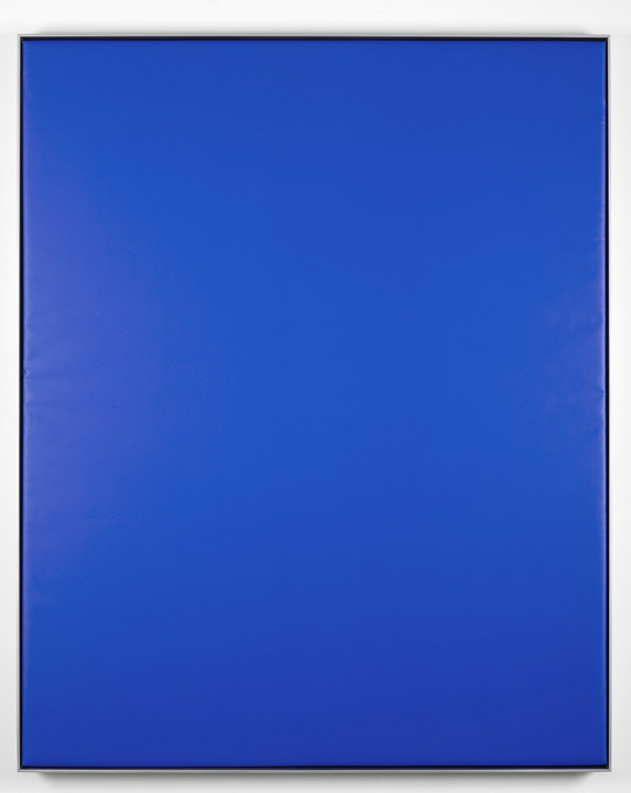
Nice write-up on AM Lowpro. The rain paintings are fantastic but I do like those gym mats too:  |
|
|
|
Post by epicfai on Nov 26, 2011 3:54:22 GMT -8
that gym mat piece is like a caricature of bad modern art.
|
|
|
|
Post by droow2 on Nov 26, 2011 7:00:33 GMT -8
Or just bad modern art?
|
|
|
|
Post by svenman on Nov 26, 2011 7:12:32 GMT -8
is it just a gym mat in a frame, or am i missing something here?
|
|
|
|
Post by afroken on Nov 26, 2011 7:16:11 GMT -8
Ha! Fair enough. To each their own.
Sven, you're not missing anything. It is a gym mat in a frame.
|
|
|
|
Post by lowpro on Nov 26, 2011 8:13:29 GMT -8
they do make me laugh..
|
|
|
|
Post by epicfai on Nov 26, 2011 12:43:34 GMT -8
the gym mat, to me, encompasses some of the "excesses" of conceptual minimalism - found object as art, blank canvas as art, etc. this is why i described it as a caricature of bad art, rather than simply bad art. sorry if my comment came off as overly flippant. i think the piece would have more impact (pardon my bad pun) if it had a patina of past usage, as though it had stories to tell. as it is, it looks fresh out of the wrapper. perhaps, however, that was the point? maybe the artist wanted the effect of an untouched canvas. regardless, it does seem to attract comment/thought.
|
|
|
|
Post by commandax on Nov 26, 2011 13:30:50 GMT -8
For those not in the know, the gym mat is clearly a reference to Yves Klein's Blue Epoch, a 1957 exhibition of 11 identical blue canvases.  |
|
|
|
Post by epicfai on Nov 27, 2011 0:09:40 GMT -8
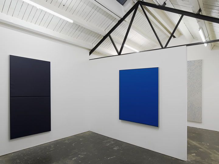
For those not in the know, the gym mat is clearly a reference to Yves Klein's Blue Epoch, a 1957 exhibition of 11 identical blue canvases.  i'm not sure that it is. viewed in the context of the exhibition it isn't just one gym mat and it isnt just blue. i certainly don't claim to be in the know however.  |
|
|
|
Post by svenman on Nov 27, 2011 1:49:11 GMT -8
i think i agree epic.
seems to owe more to marcel duchamp and the concept of the 'readymade' object as art, but it's still just a gym mat in a frame. haha.
|
|
|
|
Post by afroken on Nov 30, 2011 12:22:20 GMT -8
I went to see the show the other day. My interpretation of the work is that the gym mats represent the control and discipline of school whilst in contrast the rain paintings represent the exuberance of uncontrolled and undisciplined youth. There's definitely an element of tongue in cheek in these works.
|
|
|
|
Post by harveyn on Nov 30, 2011 13:08:00 GMT -8
I keep coming back to the vinyl blue matt work.
At a basic level the piece clearly aligns itself with the shows nostalgic perspective with respect to the artists upbringing and his surroundings. Whilst in essence this is at some levels mildly novel it is not what keeps drawing me back to this and his other works.
I think its simplicity encourages you to seek a deeper meaning which in this piece suggests a feeling of uncertainty and insecurity. The comfort blanket we seek surrounded by the cold harsh reality of life or in this case the steel frame.
This work is definitely growing on me.
|
|