|
|
Post by funkymonkey on Nov 1, 2011 14:17:23 GMT -8
Bravo on your collection, volvic! Quality pieces. Really liking Joe Jackson and Scott Campbell's works. Congrats!
|
|
|
|
Post by funkymonkey on Nov 1, 2011 3:44:35 GMT -8
Completely forgot about this auction. Very good price for these two prints in my opinion. for buyer or seller? for buyer. I think these two prints were markedly underpriced at the beginning. |
|
|
|
Post by funkymonkey on Oct 30, 2011 16:04:19 GMT -8
Completely forgot about this auction. Very good price for these two prints in my opinion.
|
|
|
|
Post by funkymonkey on Oct 28, 2011 16:33:20 GMT -8
Not exactly new, but finally framed - the pic is not the best I'm afraid as it really doesn't give you an idea of the actual size [42" x 59"]:  I always like this print. Beautiful etching. |
|
|
|
Post by funkymonkey on Oct 27, 2011 16:25:34 GMT -8
|
|
|
|
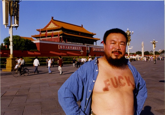
Post by funkymonkey on Oct 17, 2011 15:43:55 GMT -8
Very nice text piece, indeed.
|
|
|
|
Post by funkymonkey on Oct 16, 2011 11:36:42 GMT -8
|
|
|
|
Post by funkymonkey on Oct 16, 2011 5:57:53 GMT -8
Can't add much to what seems to be a hot thread. But, can say, at the 2010 Whitney Biennial, Tauba's pieces got blown out of the room by David Zwirner artist Suzan Frecon. Auerbach's works were big, somewhat 'dumb', and appeared quite sloppy in medium-to-close range. Their simple illusionism did not connect and left me feeling quite flat. Not impressive and not something I'd personally live with on the wall. I was let down, expecting much more. Frecon's canvas works had some of the most impressive surface and finish I've seen, with amazing color. Sitting there, you could just imagine how many thin washes were applied to build it up. The time was definitely worth it(to me), as I couldn't help but 'fall' in to the color and surface and spend the afternoon engrossed by it. Remind me somewhat of Rothko's techniques and results. Also, I see some connection to the color work used by John McCracken on his planks - that immersive kind of color that is built up through layer after layer. All-in-all, very impressive. While Auerbach is being annointed, and perhaps rightly so, I do encourage any/all to really spend time with the work in person before judging. For me, it made me not much of a fan of the folds/crumples(though, her static photos, earlier calligraphy works, some works on paper, and her prints are very appreciated). This is somewhat a strange reference. I understand that both Auerbach and Frecon are abstract/conceptual painters. However, grouping the two together is like comparing Pollock to Lewitt. In my view, Auerbach’s starting point is very scientific and conceptual. Her work is often an attempt to reinterpret chaos (such as static series) and order (such as the Bible). Auerbach is not trying to directly express a geometrical relationship. On the other hand, Frecon is a literal painter. She is very critical about her techniques in the use of geometric shapes and colors in her works. As a result, her compositions often reflect a meticulous process of repetition and fine tuning. Given the two artists are trying to address very different issues and to achieve different goals in their works; I don’t think this is an apple to apple comparison. Perhaps it’s more appropriate to place Frecon in the group of precise geometric abstractionists, such as Robert Mangold, Agnes Martin or Dorothea Rockburne. |
|
|
|
Post by funkymonkey on Sept 24, 2011 7:27:29 GMT -8
Phillips de Pury is known to be aggressive and adventurous with their estimate and lot list. For instance, all Jacob Kassay's works have been auctioned via PdP thus far. I am not sure if this is the best strategy given Sotheby's had a similar approach two years ago and got burned. Let's see how well Tauba's piece will fetch. I am a big fan of her works but this piece is not a Fold painting, in my opinion.
|
|
|
|
Post by funkymonkey on Sept 10, 2011 10:43:16 GMT -8
What a phenomenal photographer. I first saw his works in National Geographics. Those photographs are just mind-blowing. His ability to capture the essence of each character and the master use of ilfochrome process are out of this world.
|
|
|
|
MAILBAG
Sept 10, 2011 4:02:51 GMT -8
Post by funkymonkey on Sept 10, 2011 4:02:51 GMT -8
Gamma, thanks for a fantastic post. That Paul Wackers piece is a thing of beauty. I think he should be picked up by a prominent gallery more than just his packing job... This guy can seriously paint!
|
|
|
|
Post by funkymonkey on Sept 6, 2011 16:49:16 GMT -8
Congrats to those who bagged these beauties as they look fantastic together! By the way, it looks like TA is included in an exhibition at Tate St. Ives with well known folks and some lesser known but talented painters: www.tate.org.uk/stives/exhibitions/the_indiscipline_of_painting/default.shtmHere is the press release if you want to save yourself a click: The Indiscipline of Painting is an international group exhibition including works by forty-nine artists from the 1960s to now. Selected by British painter Daniel Sturgis, it considers how the languages of abstraction have remained urgent, relevant and critical as they have been revisited and reinvented by subsequent generations of artists over the last 50 years. It goes on to demonstrate the way in which the history and legacy of abstract painting continues to inspire artists working today. The contemporary position of abstract painting is problematic. It can be seen to be synonymous with a modernist moment that has long since passed, and an ideology which led the medium to stagnate in self-reflexivity and ideas of historical progression. The Indiscipline of Painting challenges such assumptions. It reveals how painting’s modernist histories, languages and positions have continued to provoke ongoing dialogues with contemporary practitioners, even as painting’s decline and death has been routinely and erroneously declared. The show brings together works by British, American and European artists made over the last five decades and features major new commissions and loans. It includes important works by Andy Warhol, Frank Stella, Gerhard Richter and Bridget Riley alongside other lesser known artists such as Tomma Abts, Martin Barré, Mary Heilmann and Jeremy Moon. The Indiscipline of Painting is a collaborative project between Tate St Ives and Mead Gallery, Warwick Arts Centre. The exhibition travels to the Mead Gallery and opens on the 14 January 2012, running until 10 March 2012. As part of The Indiscipline of Painting, Newlyn Art Gallery has commissioned John M. Armleder to make a major new work. John M. Armleder is at Newlyn Art Gallery 8 October 2011 – 3 January 2012. The exhibition will be showing works from the following 49 artists (in alphabetical order): Tomma Abts born 1967; John M. Armleder born 1948 ; Tauba Auerbach born 1981; Martin Barré 1924 – 1993; Francis Baudevin born 1964; Daniel Buren born 1938 ; André Cadere 1934‑1978; Ingrid Calame born 1965 ; Keith Coventry born 1958 ; Michael Craig‑Martin born 1941 ; Karin Davie born 1965; Peter Davies born 1970; Gene Davis 1920‑1985; David Diao born 1943; Moira Dryer 1957 – 1992; Bernard Frize born 1949; Michelle Grabner born 1962; Tim Head born 1946; Alex Hubbard born 1975; Katharina Grosse born 1961; Peter Halley born 1953; Jane Harris born 1956; Mary Heilmann born 1940 ; Jacob Kassay born 1984; Richard Kirwan born 1969; Imi Knoebel born 1940; Bob Law 1934‑2004; Sherrie Levine born 1947; Jeremy Moon 1934‑1973; Olivier Mosset born 1944; Carl Ostendarp born 1961; Blinky Palermo 1943‑1977; Steven Parrino 1958-2005; David Reed born 1946; Gerhard Richter born 1932; Bridget Riley born 1931; Ruth Root born 1967; Robert Ryman born 1930; Sean Scully born 1945; Frank Stella born 1936; Myron Stout 1908-1987; Daniel Sturgis born 1966; Cheyney Thompson born 1975; Niele Toroni born 1937; Richard Tuttle born 1941; Dan Walsh born 1960; Andy Warhol 1928‑1987; Peter Young born 1940; Heimo Zobernig born 1958. The exhibition has been selected by British artist Daniel Sturgis, and curated with Martin Clark, Artistic Director, Tate St Ives and Sarah Shalgosky, Curator, University of Warwick. |
|
|
|
Post by funkymonkey on Sept 1, 2011 14:53:40 GMT -8
Strangely relieved these do very little for me, as I simply do not have the funds. Had been wondering if they'd grow on me before release after seeing the images so long ago. Strange too, cause she has seemed to no wrong in my books ever since I started paying attention to her a few years back. I'm sure they're lovely in the flesh, though. Can anyone who knows a great deal about printmaking articulate effectively what an etching is, how it differs from the conventional serigraph/screenprint, and why these works benefit from such a process? lowpro, Crown Point Press has some fantastic information about the traditional printing method before giclee/xerox machine is available: www.crownpoint.com/printmakingMany of these fantastic etching printmakers have once worked for Crown Point, such as Paulson, Bott, Pettengill and many many others. Hope you find the link useful and enjoy. |
|
|
|
Post by funkymonkey on Aug 31, 2011 16:22:50 GMT -8
congrats rkitek!
|
|
|
|
Post by funkymonkey on Aug 30, 2011 17:05:00 GMT -8
Beautiful Neate and Parla, indeed. Congrats!
It seems like Elms are putting their efforts in Asia. Has anybody seen Neate's recent sculptures in person? Interested in knowing more about his progress.
|
|
|
|
Post by funkymonkey on Aug 30, 2011 16:30:12 GMT -8
Here for sale are a set of collaborative works by world renown artists: These are both absolutely stunning works. The success of these two artist and the rarity of this collaboration, make these a very sought after set that is sure to shoot up in value. Beautiful works, unfortunate comments... |
|
|
|
Post by funkymonkey on Aug 22, 2011 18:23:28 GMT -8
tauba is on a whole other level. she's got the backing to produce the entire edition. not to sound rude, but giclee prints are (in my opinion) the lowest level of editions. well, maybe xerox is below them. these books are completely hand produced. I have to agree with avert wholeheartedly. Giclee prints can be mass-produced easily with a click of a button. You cannot compare those prints with these hand-made editions by Tauba. As a pseudo-scientist, I am very intrigued by the concepts behind each book where Tauba examined the continuous transformation of geometry. “1,11,121,1331” is absolutely brilliant. Wish I can see it in person. |
|
|
|
Post by funkymonkey on Aug 21, 2011 15:05:40 GMT -8
so has anyone here bought one of these beauties? Short answer; yes. Long answer; absofuckinglutely!  CONGRATS! |
|
|
|
Post by funkymonkey on Aug 19, 2011 5:40:26 GMT -8
These books are phenomenal! Float and Wood are now $16K, Recession is $7.5K. I have some pics in details. I am not sure if I can post them here since I got them from the gallery. If anybody is interested, I can PM them to you.
|
|
|
|
Post by funkymonkey on Aug 17, 2011 20:39:07 GMT -8
Beautiful Wackers! His perception of dimensionality takes a bit to comprehend. Just a beautiful piece. Congrats!
|
|
|
|
Post by funkymonkey on Aug 16, 2011 19:20:51 GMT -8
I am not qualified for entering. But this is a great little give away for somebody. What a fantastic looking show. Good on you.
|
|
|
|
Post by funkymonkey on Aug 4, 2011 5:44:37 GMT -8
I am new to this board. This is a fantastic forum and those are beautiful Palladino's! Congrats!
|
|