|
|
Post by drevil on Feb 9, 2013 8:09:28 GMT -8
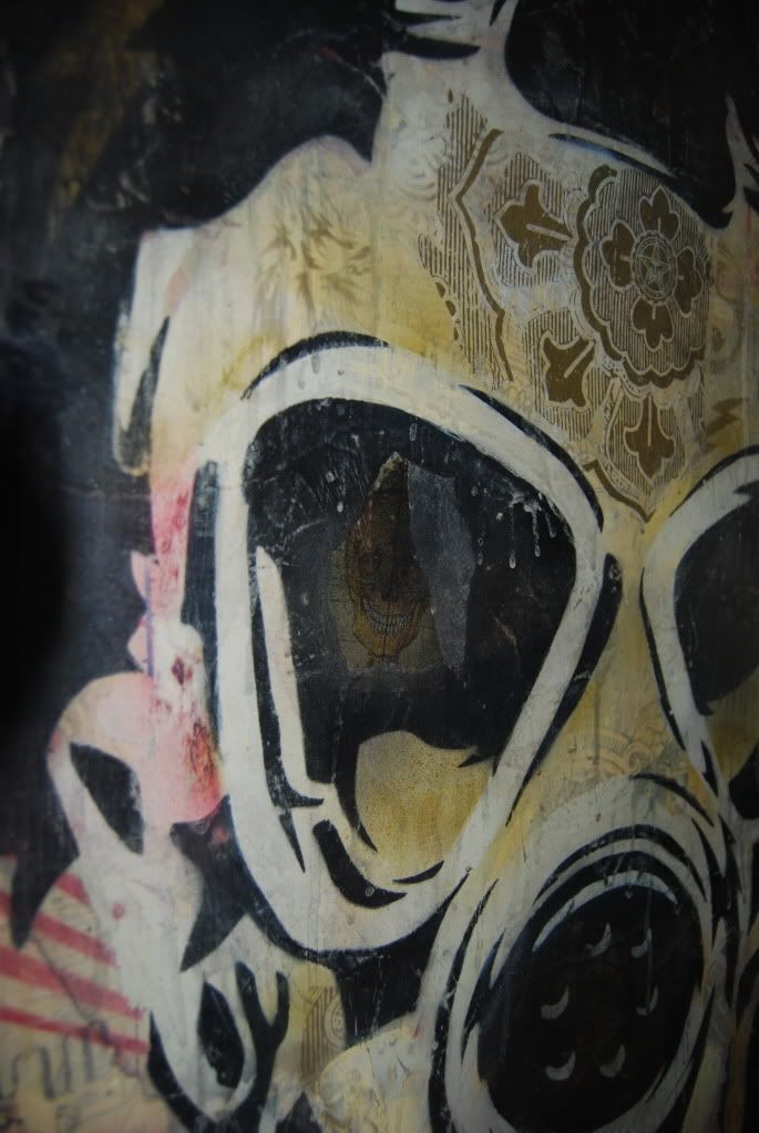
To me this is one problematic aspect and one of the reasons I characterized this as a devolution. My understanding is that one of his core tenets is the reproduction of urban city walls showing the layering of graffiti, flyers, etc over time. To my eye his older work does a much better job of capturing this concept. When was the last time you saw urban city walls that are sky blue? Those are my favorite canvases. However I like them as pretty paintings rather than conceptually strong works. They look nothing like a city wall. It seems to me these colors are likely being pursued to produce a more saleable product that appeals to people who don't really want much conceptual depth in their art (though they would never recognize this in themselves). I have not read anything to that undermines this hunch. In the last few years Jose has done a lot of traveling outside of major cities. In fact, he has visited jungles, oceans and mountains. I believe this is where the inspiration for added colors comes from. Turning them more towards representations of landscape paintings than urban decay. This would make the situation even worse, if true. IMO. Besides I see no evidence of this in the Haunch materials. |
|
|
|
Post by drevil on Feb 9, 2013 5:08:24 GMT -8
Thanks for the images Volvic. I for one think this show looks particularly strong and absolutely love his movement into these more vivid colours. I love both the colour palette and composition. I am in love!!!!! 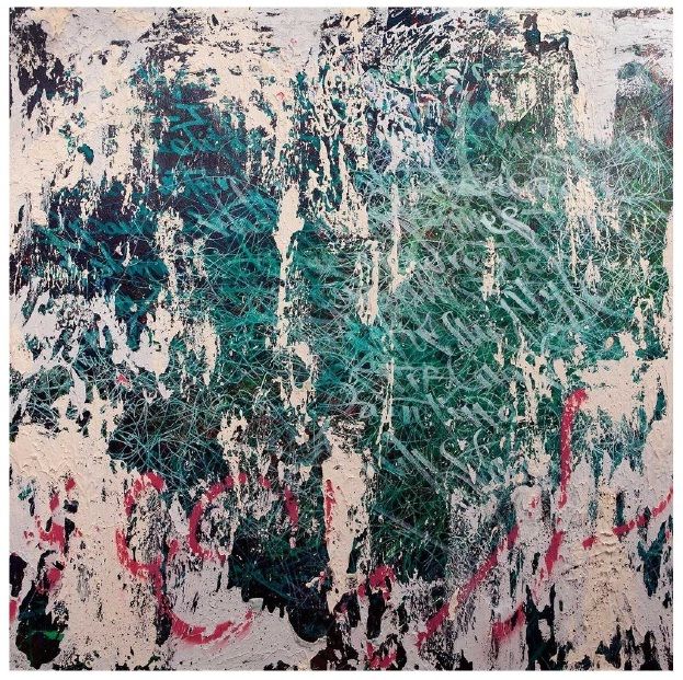 To me this is one problematic aspect and one of the reasons I characterized this as a devolution. My understanding is that one of his core tenets is the reproduction of urban city walls showing the layering of graffiti, flyers, etc over time. To my eye his older work does a much better job of capturing this concept. When was the last time you saw urban city walls that are sky blue? Those are my favorite canvases. However I like them as pretty paintings rather than conceptually strong works. They look nothing like a city wall. It seems to me these colors are likely being pursued to produce a more saleable product that appeals to people who don't really want much conceptual depth in their art (though they would never recognize this in themselves). I have not read anything to that undermines this hunch. |
|
|
|
Post by drevil on Feb 7, 2013 14:40:20 GMT -8
This work is somewhat different than I have seen him produce in the past. And he is taking steps in different directions here than he has before. Good for him.
But I see this body of work as a whole as fairly weak. Devolving rather than evolving. Meh for me.
|
|
|
|
Post by drevil on Jan 31, 2013 6:36:59 GMT -8
Bump. Taking reasonable offers.
|
|
|
|
Post by drevil on Jan 31, 2013 6:23:58 GMT -8
this kid is EVERYWHERE. Liking these fades more than earlier renditions. Thanks for sharing Agreed. I haven't decided whether this is a good thing or not though. On the one hand it gets his work out there and more people familiar with him and his style of work. On the other hand, there does not appear to be any real filter between what he makes and what ends up in a gallery. Regardless, he is a one man machine. I also saw he has an NYC solo this year. Having just had one last year as well. |
|
|
|
Post by drevil on Jan 30, 2013 22:25:14 GMT -8
|
|
|
|
Post by drevil on Jan 30, 2013 16:04:47 GMT -8
Good recent transactions with mose (seller), Jean Pascal (buyer), and rauschadam (buyer). Thanks all.
|
|
|
|
Post by drevil on Jan 26, 2013 7:46:14 GMT -8
This appears to have been nothing more than a cruel joke on flippers.
|
|
|
|
Post by drevil on Jan 24, 2013 19:09:58 GMT -8
My $30 copy works just fine for me.
Does it seem odd to anyone that a book primarily focused on his fade work is wrapped in what looks like a river rock piece?
|
|
|
|
Post by drevil on Jan 24, 2013 11:13:34 GMT -8
Thank you.
|
|
|
|
Post by drevil on Jan 23, 2013 14:58:29 GMT -8
I generally enjoy his work. But I'm not really sure what these are all about. Any one have any insight? Also agree that his output is crazy. He is like a one man Warhol.  Noticed that he also has a new ltd edition book with sculpture at Gottland. gottlundverlag.com/catalog.html |
|
|
|
Post by drevil on Jan 18, 2013 13:54:47 GMT -8
Why is it silly? Serious question. Doesn't one only look at price if planning to buy? If I think something is expensive it doesn't change my opinion of the work. There's a lot of art that I am indifferent to and that I wouldn't have even if it was dirt cheap - some of it is actually very costly. Equally there's a lot of art that I love but I wouldn't buy it because its out of my reach or comfort zone, but I still love it. It is possible to look at and enjoy art without fixating on the price, surely? The fact that this is around $25k (a guess btw) does not impact my opinion of the work. I like it because it makes me think. I like it less because Nick does not seem to think. However, as a collector of art in this area price is part of my overall consideration of the work. There are two different angles at work here. My opinion and cost. If they overlap in the right way I may buy. If they don't overlap I won't buy. Art from emerging artists is more interesting to me and I tend to spend more time considering them if I can afford the art. In a world with so much art I simply can't invest the time in everything I see that it may deserve. I have a day job to attend to. So I focus on price to some degree as part of the equation. If I want to look at important art without regard to price I will simply go to a museum. Hope this makes things more clear rather than less so. |
|
|
|
Post by drevil on Jan 18, 2013 13:26:45 GMT -8
The 3 panel penny work looks nice in the picture. The problem to me is that that set up would cost around, what, $25k? For that kind of coin I could buy something much better, IMO. I have no idea what this gallery is pricing the work at but I'd be very surprised if it's anywhere near that. But anyhow, I don't understand what the price has to do with it. Does that influence your opinion of the work? Can't you just appreciate it, or hate it, for what it is? Don't misunderstand me. I do appreciate it and stated that I think it looks nice. I have gone on record multiple times saying that I like these. But to ignore the price completely is pretty silly. |
|
|
|
Post by drevil on Jan 18, 2013 12:47:06 GMT -8
The 3 panel penny work looks nice in the picture. The problem to me is that that set up would cost around, what, $25k? For that kind of coin I could buy something much better, IMO.
|
|
|
|
Post by drevil on Jan 11, 2013 12:57:38 GMT -8
Bump. Price reduced to $775 on the Heron.
|
|
|
|
Post by drevil on Jan 10, 2013 10:03:04 GMT -8
interesting find. Sara is a smart lady. Maybe this is Lucien's tribute to her? My guess is that he had no idea she did this work or that it was displayed at Ps1 in 2006. He was what, 14 years old then? Ha. |
|
|
|
Post by drevil on Jan 10, 2013 7:37:13 GMT -8
|
|
|
|
Post by drevil on Jan 9, 2013 18:54:12 GMT -8
This thread makes me smile. Great...Best...Recommended...
Ok then. I'm sold.
|
|
|
|
Post by drevil on Jan 5, 2013 15:15:03 GMT -8
Blackbird sold. Heron still available at the moment. Pm with interest or questions.
|
|
|
|
Post by drevil on Jan 5, 2013 12:04:45 GMT -8
Weiwei sold.
|
|
|
|
Post by drevil on Jan 5, 2013 10:15:59 GMT -8
those are such nice Petersons.. good luck with the sale! Thanks. Good amount of interest and a couple of expired holds, but both are still available. Pm if interested. |
|
|
|
Post by drevil on Jan 4, 2013 19:20:00 GMT -8
And they are both from his show at the Shooting Gallery in SF. FYI. Pics are on their website yet.
|
|
|
|
Post by drevil on Jan 4, 2013 19:17:14 GMT -8
They are both: Oil on Panel with Metal Mesh, 18x13.5".
|
|
|
|
Post by drevil on Jan 4, 2013 16:41:04 GMT -8
Didn't get it.
|
|
|
|
Post by drevil on Jan 4, 2013 15:15:25 GMT -8
Wei wei Attachments:
|
|