|
|
Post by highbrow on Nov 7, 2012 9:25:22 GMT -8
my favorite piece of his I think I have seen
|
|
|
|
Post by MrJames on Nov 7, 2012 12:23:41 GMT -8
I love it, wonder what the size of the piece is? I like the imagery and then the scale of the image that runs through my mind. Is the helmet really small or is the hermit crab really big? |
|
|
|
Post by murdock on Nov 8, 2012 7:54:33 GMT -8
One more from the JK board: "Calliope" - Acrylic on panel - 32" x 40" I think both are superb and a great new direction. |
|
|
|
Post by epicfai on Nov 8, 2012 15:25:06 GMT -8
I really like Lifted 2. Nice piece.
|
|
|
|
Post by oldfartatplay on Nov 8, 2012 17:54:19 GMT -8
I really like Lifted 2. Nice piece. Me too, that was my first pick when I got the preview. I've been pestering Roq since last year about acquiring a piece and sadly I got shut out again. I'm giving up on trying to buy an OG Josh Keyes  If you see this Josh maybe you can give me some advice on how this works. |
|
|
|
Post by hillsj2001 on Nov 8, 2012 21:35:16 GMT -8
I really like Lifted 2. Nice piece. |
|
|
|
Post by sleepboy on Nov 8, 2012 23:20:29 GMT -8
Lifted 2  |
|
|
|
Post by hillsj2001 on Nov 9, 2012 7:58:15 GMT -8
Lifted 2  think this is my favorite from the show |
|
|
|
Post by lowpro on Nov 9, 2012 23:41:14 GMT -8
The hermit crab piece is cute.
|
|
|
|
Post by highbrow on Nov 10, 2012 9:14:53 GMT -8
The print looks amazing, slightly sad that 20 percent of the run is already on the bay , not sad cause they are there, but I feel like the gallery and Josh could have charged more and gotten more revenue for the charity.
|
|
|
|
Post by sleepboy on Nov 10, 2012 10:04:18 GMT -8
|
|
|
|
Post by murdock on Nov 10, 2012 11:30:44 GMT -8
The print looks amazing, slightly sad that 20 percent of the run is already on the bay , not sad cause they are there, but I feel like the gallery and Josh could have charged more and gotten more revenue for the charity. Don't wanna go negative here, but I really don't understand why they didn't charge more, esp. with charity involved... |
|
|
|
Post by murdock on Nov 29, 2012 6:00:51 GMT -8
|
|
|
|
Post by duckyhoward on Nov 29, 2012 13:55:28 GMT -8
The trick with photos from facebook is to delete the "s" after the http at the start of the image link - and it should work all ok.  love these process photos so us mere mortals can see how the piece takes shape.  |
|
|
|
Post by sleepboy on Dec 1, 2012 14:39:01 GMT -8
Saw this on the News section of his website. Perhaps his new print coming up?  |
|
|
|
Post by hillsj2001 on Dec 1, 2012 20:01:48 GMT -8
Saw this on the News section of his website. Perhaps his new print coming up?  ahhhh...yet another to strike out on  |
|
|
|
Post by murdock on Dec 2, 2012 2:35:15 GMT -8
Fingers crossed for another large edition  |
|
|
|
Post by duckyhoward on Dec 3, 2012 21:26:13 GMT -8
Confidence people ;D - i am quietly confident that given my appalling luck on recent drops including the last couple of Josh's and Jeremy Geddes' most recent releases that my luck will change and i will score a Lifted II print direct from Josh when it is released. I am thinking an edition size of 100 would be good (maybe up to 150) - and hoping for a 24x32 size (to compliment Lifted I), but i note this would actually make the print larger that the OG (which is 20x24). not sure if Josh has up sized on any of his other print releases. But i am very happy to have picked this up the other day and have it is my hands - but i must admit to feeling a bit 'dirty'  because i would have much rather have paid the galley the list price and not the price i ended up paying. but it is now in a good home and wont be going anywhere but on my wall if I can help it. ![]() fbcdn-sphotos-a-a.akamaihd.net/hphotos-ak-snc7/315774_10151333471746944_1308934857_n.jpg fbcdn-sphotos-a-a.akamaihd.net/hphotos-ak-snc7/315774_10151333471746944_1308934857_n.jpg [/img] |
|
|
|
Post by bmerel on Dec 4, 2012 14:26:13 GMT -8
|
|
|
|
Post by cpk on Dec 4, 2012 19:33:41 GMT -8
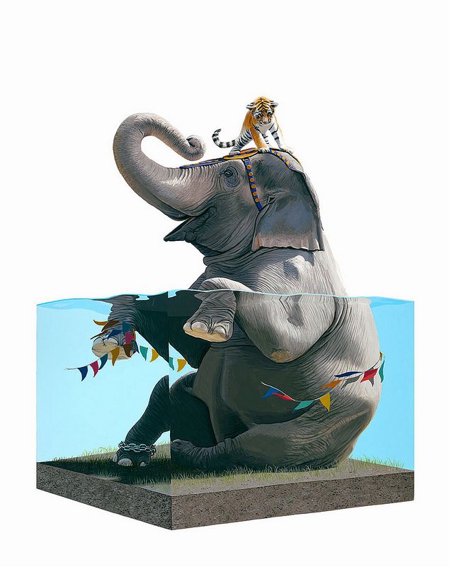
Could be my recent obsession with circus lore, but I am really liking this new work. The smattering of bright colors against the white background and the neutral colors draws my eyes to the details.
|
|
|
|
Post by murdock on Dec 5, 2012 0:11:26 GMT -8
Haha, I was thinking EXACLTY the same thing (about the colors and attention) when I just marveled over ducky's print, above ;D
Way to go, duck!
|
|
|
|
Post by saL on Dec 5, 2012 5:53:33 GMT -8
|
|
|
|
Post by duckyhoward on Dec 6, 2012 18:24:54 GMT -8
For fans of Josh's work who may have ordered one of these Laminate Mags to get the signed Scorch II cover, the image Josh is signing is actually double sided and Josh is signing both sides. One side is Scorch II and the other is Tangled IV. Scorch II  AND Tangled IV - this might be the closest most of us get to this one.  Order here: shop.laminatemostwanted.com/product/laminate-8-most-wanted-palette-graffters |
|
|
|
Post by bmerel on Dec 6, 2012 19:10:01 GMT -8
heres how the new wall came together. feedback welcome! iphone panorama pic.. Attachments:
|
|
|
|
Post by murdock on Dec 7, 2012 1:44:04 GMT -8
Wow, Brian, this looks way awesome!
|
|