xpc
Full Member
  
Posts: 184
|
Post by xpc on Mar 11, 2009 19:06:37 GMT -8
WOW.....that's amazing. Which lucky member picked up Scorch?  |
|
|
|
Post by kidrobotct on Mar 11, 2009 20:19:43 GMT -8
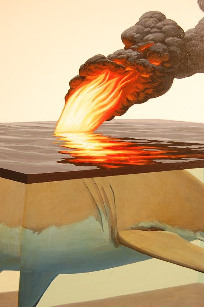
I wonder is these are for the SCOPE fair in march or his solo in may... Shark is nice concept but the colors seem a little dull...dirty? Maybe it's the pic. On second look, i'm sure it's on purpose with what looks to be an oil slick? on the surface. managed to check out scope last weekend and i'd have to say that the colors on shark are dull only on the pic. i'll post pics in the next couple days but the piece looked great in person. |
|
|
|
Post by kidrobotct on Mar 12, 2009 5:56:19 GMT -8
|
|
|
|
Post by sleepboy on Mar 12, 2009 22:07:53 GMT -8
SCOPE pieces and the antler/tree piece are amazing. Makes me want to get on the hunt again...
|
|
|
|
Post by kidrobotct on Mar 13, 2009 7:06:35 GMT -8
oops...didn't realize i posted same pic twice. here's the close up I meant to post  |
|
|
|
Post by sebreg on Mar 13, 2009 9:03:56 GMT -8
Great close-up on Scorch! What a great piece.
|
|
|
|
Post by sebreg on Mar 15, 2009 9:42:21 GMT -8
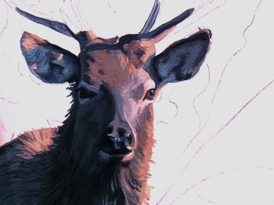
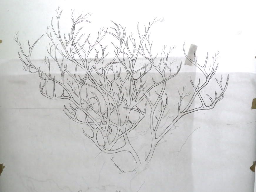
Josh just posted these pics, new stuff he is working on...   |
|
|
|
Post by sleepboy on Mar 15, 2009 21:11:05 GMT -8
i'm liking the antler-trees
|
|
|
|
Post by jediak on Mar 16, 2009 6:58:57 GMT -8
I know this is going to not be a popular opinion but I have to say it. I am a fan of Keyes work, I have been to several of his openings, my favorite being the Josh Liner show he did with Jeremy Fish and I own several of his prints but I don't think the pieces translate very well when they are done on small canvases. I was at scope and saw the pieces and I did not see what all the fuss was about, I even made a comment at the booth and I could be paranoid in saying this but felt it was not received well by the people standing close by that over heard. It’s strange because like I said I am a fan but as a fan of his work I think criticism is equally important to praise and I can still be a fan and not think these or for that matter the majority of his small canvases are as nice as the large scale works. A Josh Keyes piece is not great because of the name and recent collectability of his work but for the work it’s self. Not all works created are equal, If I were to purchase one of his paintings it would be one that I loved not one just for the sake of it being a Keyes and right now if I may be so bold it seems that some people are just happy with any piece that has the name Keyes at the bottom.
|
|
|
|
Post by sebreg on Mar 16, 2009 11:51:50 GMT -8
I pretty much agree, not all work created by the same artist is going to be of the same quality or strike you as being excellent. Given the chance, I would only buy a piece I really liked.
I think it's important to critique artists, especially our favorite ones. Silly to become a cheerleader for absolutely everything your favorite artist does...
|
|
|
|
Post by devours on Mar 16, 2009 14:42:09 GMT -8
I pretty much agree, not all work created by the same artist is going to be of the same quality or strike you as being excellent. Given the chance, I would only buy a piece I really liked. I think it's important to critique artists, especially our favorite ones. Silly to become a cheerleader for absolutely everything your favorite artist does... That is something I absolutely believe as well. I find it strange when other fans/collectors get their panties in a knot if you are critical of one of your own favorite artists. Don't we want them to push their creative limits? Don't we want them to grow and continue their journey and not remain stagnate? I tend not to listen or believe in fans that love absolutely every single piece an artist does. I find that a very lukewarm and mediocre view to just love every thing, it is almost an easy opinion to take. |
|
|
|
Post by lowpro on Mar 16, 2009 17:13:40 GMT -8
A Josh Keyes piece is not great because of the name and recent collectability of his work but for the work it’s self. Similarly, a Josh Keyes piece shouldn't be considered poor simply because of it's size. I'm trying to understand your comments, but there seems to be a bit of a contradiction. You make clear you didn't find the SCOPE pieces compelling apparently because of their size alone and that to you his larger works are his best ones. In my opinion, however, size and quality occur entirely independently and have nothing to do with one another. To say a Keyes painting isn't anything special strictly because of its size is ridiculous to me. Some of my favorite Keyes works are not only in his go to 18x24 format, but were even smaller. The Watcher and Sleeping series, some of his strongest and most iconic works, were all 12x12. Moreover, Keyes has historically worked in only three scales; small 12x12 pieces, medium 18x24 works, and large 30x40 ones (with some older 36x48 canvas paintings). Personally, I wouldn't consider 18x24 as small at all, especially when keeping the limited formats the artist uses in mind. But perhaps, I'm not fully understanding your post due to a lack of clarity. I think it's important to critique artists, especially our favorite ones. Silly to become a cheerleader for absolutely everything your favorite artist does... I couldn't agree more. I'm usually the first to vocalize unease with the direction an artist I'm fond of is taking. With Josh, however, I have found it extremely difficult to be critical of any of his work from the OKOK Gallery exhibit on, especially his most recent works. In fact, Flutter and Scorch are probably two of my most favorite Keyes works to date...not to mention how strong the two Call paintings were, along with this newest Rise Above piece. So, while I agree it could most definitely be deemed silly to perpetuate any sort of blind, hype-induced praise for everything someone's favorite artist does. When your favorite artist keeps doing everything you'd ever want, and has begun to even exceed the expectations you've set for him, I'm perfectly content signing up for the cheerleading squad. Give me a "J"....What's that spell?!?! All I can hope is that some of you have picks coming up in June and that you're unable to find something you "love" and end up passing. I know I'll happily take your position. And it has nothing to do with the fact that Josh's name is at the bottom of it. It has everything to do with with the phenomenally rendered, conceptually poignant, and flat-out awesome and quirky painting to the upper left of that signature. Hype has nothing to do with it for me. There isn't a single artist out there today who's art resonates with me so strongly from both a conceptual and aesthetic perspective. As they say, to each their own. Ultimately, divergent opinions are what keep places like this lively anyway, so your - and everyone's - comments are welcome. |
|
|
|
Post by jediak on Mar 17, 2009 6:39:23 GMT -8
(Lowpro)I don’t think a small piece is poor simply based on size I just wanted to make my tastes known in relation to the criticism, I wanted there to be some context that I prefer his larger works over the smaller pieces so that people could take what I was saying with a grain of salt rather then gospel. I also felt that the other side needed to be heard and that there are people out there who went to Scope and didn’t think much of the two pieces showing in relation to the news that people slept outside over night for the opportunity to buy the pieces. It is worth noting that originally when I saw the images online I appreciated them much more then when I saw them up close, my girlfriend brought up an interesting point that how much white space surrounding the subjects seems to play a roll on how much I enjoy one of his pieces or not. I prefer it when there is a lot vs. a little and larger canvases seem to have a ratio that I prefer as a result which is strange because I can’t think of an other artist that makes me feel that way. What ever the case I am comfortable in sticking with my original thought that it’s hard to criticize his work on any level because fans are so (for complete lack of better wording) “Blindly” passionate about it and that in it’s self is unappealing to me. I also don’t think this is limited to Keyes by any matter but his work was topical in this case.
|
|
|
|
Post by sleepboy on Mar 17, 2009 8:27:06 GMT -8
For some reason there are rarely Keyes pieces that I don't like recently. I do think certain parts of the painting could be done better for example when certain creatures are disproportionately larger than they are supposed to be. Also, when you finally see a Keyes painting in person, you realize it's not as "tight" as you thought it was, but that's probably just not his style.
All in all, I've been willing to buy most of the stuff he has had out recently even though I'm on a buying freeze. But definitely, there are different opinions out there.
|
|
|
|
Post by sebreg on Mar 17, 2009 8:54:44 GMT -8
Also, when you finally see a Keyes painting in person, you realize it's not as "tight" as you thought it was, but that's probably just not his style. Yeah, I realized over time his work wasn't quite as tightly painted as I initially thought. But his imagery is usually so good, and his painting, while not extremely tight, is still very well done and works well for his style. I think if he had crazy detail and tightness, it might stiffen up his paintings and take away from the imagery. Just a guess. |
|
|
|
Post by juggernut3 on Mar 17, 2009 9:58:19 GMT -8
First off, Lowpro has it right. A piece should not be prejudged by its size... It should be judged for content (idea/originality), composition, effort... all should go into judging the overall piece's merit. (Both independently and besides its peers) The size is just the frosting on the cake.
I think Josh's last show at OKOK was his strongest overall show. The "Call 1" was one of his most well executed piece to date when I saw it in Miami. The "Call 2" looked great initially... but the bear seemed a little midget in ration to the truck. While Flutter was my favorite piece at Scope going in... I have to agree, it disappointed me to see it in person. The butterflies could have been more detailed/tight and they seem a little off color. While Scorch had the opposite affect on me, it was awesome in person. The water murky-ness was amazing and the Shark gave me that "jaws" creepy effect.
With that said, here's something I've personally noticed IMHO... I've put on my riot gear & helmet, so here goes...
-Josh Keye's bigger pieces SEEM to me to be tighter and more detailed in quality overall when compared to most of the smaller pieces. (Came to this conclusion after seeing many small and large paintings of his.)
Maybe this is due to the fact that more of his bigger sizes from his recent shows... and as many artist progress in their careers, they refine and improve their technique. Some artists prefer to work on larger OR smaller sizes... This is merely my observation based on seeing Josh's works in person.
This is merely my opinion... and only applies towards the technique and not his content. From a content point of view, he's been SMASHING it! Every time a new piece comes out, it seems to be elevating my perception of him as an artist. As with all artists, I'm sure there are varying levels of work in both concept and size. All we can hope is that we can get past our initial excitement and hype to make a sound judgment in our purchases.
|
|
|
|
Post by devours on Mar 17, 2009 13:04:58 GMT -8
|
|
|
|
Post by sleepboy on Mar 18, 2009 8:10:02 GMT -8
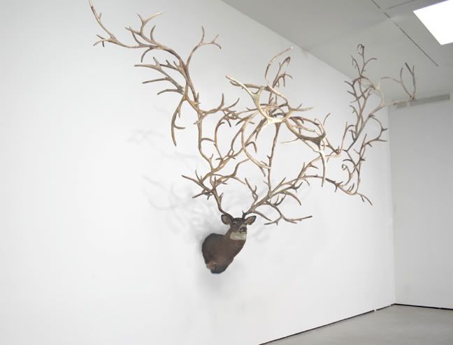
Interesting. Who's the artist?  |
|
|
|
Post by rizza79 on Mar 18, 2009 8:46:48 GMT -8
by the looks of the website it is a collaboration of Carolyn Salas and Adam Parker Smith.
|
|
|
|
Post by ricosg11 on Mar 18, 2009 10:05:55 GMT -8
that was on view at scope. While it may be an interesting idea, imo, it was executed very poorly/cheaply
|
|
|
|
Post by devours on Mar 18, 2009 12:30:28 GMT -8
Yeah Carolyn Salas, and I guess the work was considered more of a natural form, since it it true that antlers will grow outward but will twist and conform back onto themselves due to the sheer weight. I guess they felt if the antlers were straighter it would not be as realistic.
|
|
|
|
Post by rizza79 on Mar 20, 2009 9:03:25 GMT -8
Mr Keyes looks to be on fire!!.........  apparently he is going to visit the scorch concept some more. |
|
|
|
Post by rhinomilk on Mar 20, 2009 9:07:17 GMT -8
scorch is the new dissected.. nice!
|
|
|
|
Post by ricosg11 on Mar 20, 2009 10:22:05 GMT -8
Yeah Carolyn Salas, and I guess the work was considered more of a natural form, since it it true that antlers will grow outward but will twist and conform back onto themselves due to the sheer weight. I guess they felt if the antlers were straighter it would not be as realistic. I wasnt referring to the shape, more the way it was put together and all the visible seems. |
|
|
|
Post by becomingrobot on Mar 25, 2009 9:58:49 GMT -8
I like his work. I wonder where it will go in time. He can keep interchanging subject matter in this framework and still kick ass, but I'd love to see what would happen if he started thinking more sculpturally or in terms of installation.
Actually, I would LOVE to see one of his landscapes rotating in 3D space with a little world of SIMS style people/deer/campfires going about... put that shit on loop in little windows we could look through, or project it LARGE. Actually, those would be awesome as sculptures too.
|
|