|
|
Post by saL on Mar 30, 2011 14:50:36 GMT -8
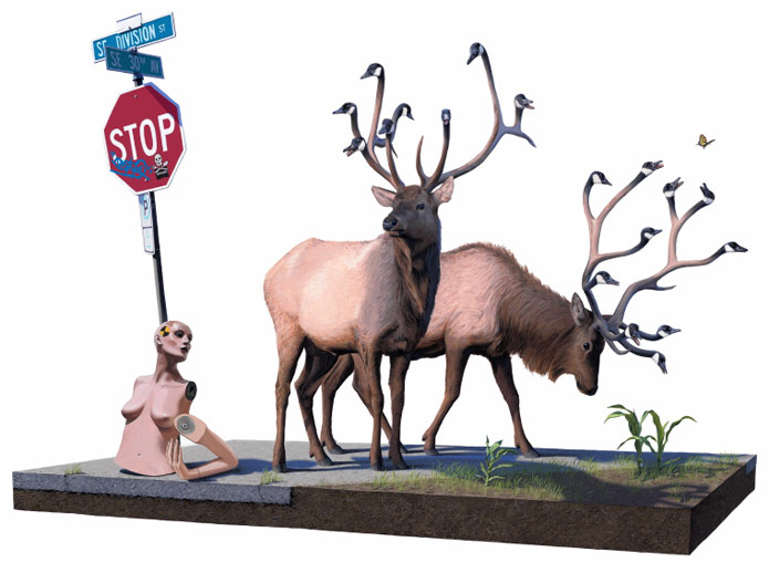
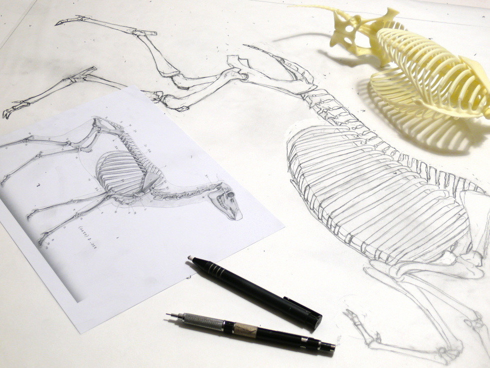
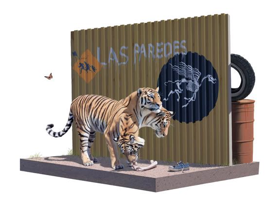
Whatever the reasoning, if any from Josh's forum: "Yes I really like both of those pieces (Banksy & Skullphone) , and thought they would fit in well with the United States US future plans for border control using genetically modified organisms. Also a nod to Ray Harryhausen, he was one of my childhood hero's."btw, just found this @ FecalFace studio visit article:  more detail photos & studio snaps @ FecalFace |
|
|
|
Post by lowpro on Mar 30, 2011 16:56:04 GMT -8
Here's a nice close up of The Cerberus Project from his site, which shows more detail than anything on the FF post.  Quite impressive. |
|
|
|
Post by mancub on Mar 30, 2011 17:12:02 GMT -8
Thanks Sal and Lowpro, there is definitely more than meets the eye.
|
|
|
|
Post by sleepboy on Mar 30, 2011 17:31:38 GMT -8
Definitely look better closeup. This piece is growing on me. Be interested to see if the drawings in the show are just studies for these pieces or older pieces or standalone drawings.
|
|
|
|
Post by lowpro on Mar 30, 2011 19:24:19 GMT -8
Definitely look better closeup. This piece is growing on me. Be interested to see if the drawings in the show are just studies for these pieces or older pieces or standalone drawings. Yeah, I wasn't sure what to think of either of these new pieces initially. Truly love when a new body of Josh's work is unveiled, as it never ceases to surprise. But that detail shot totally blows me away. Still need some time to absorb Writhing. That manikin is downright disturbing. Def some throwback themes here. And definitely interested to see what the graphite pieces are all about as well, especially considering we've never really seen a fully composed drawing from him. His concept sketches are typically way more concept than sketch..which I've always loved as it's amazing to see where they end up on panel with acrylics. Waking is still my favorite of the three paintings revealed by far. The simplicity and mystical elements really speak to me. Just wish there was a little color added somewhere to pop things off, as the palette is almost too muted..a red flower or two growing out of the ground to compliment the yellow ones, some blossoms or an apple or something growing on the antler tree limbs, a single butterfly or bird flying about..or a ladybug, as they're always good luck! As a fan of fractals, though, I think the addition of the spiral fossil is fitting. Really think it's one of his finest pieces to date still. One of the things I liked most about that second teaser image was the concept drawing hanging on the wall for Waking. My eyes keep gravitating to that thing. It almost looks like it was done in a trance with some frenetic energy coaxing it out of Josh. It has some dark, raw, almost Tim Burton-like qualities that are so contrary to his paintings. But I have a feeling the drawings will probably be nice and clean like that first teaser of Waking..  |
|
Jesús
Full Member
  
Posts: 199
|
Post by Jesús on Mar 30, 2011 20:00:24 GMT -8
The Cerberus Project 30"x40" acrylic on panel  Posted by Josh on his forum - WOW!!!! wonderful. somewhat of a return to an older style. i like that a lot. so the solgan reads 'walls have ears' and there are references to banksy and skullphone....? Actually, it only says 'The Walls' (Las Paredes). Quite impressive nonetheless...  |
|
|
|
Post by svenman on Mar 31, 2011 4:21:24 GMT -8
wonderful. somewhat of a return to an older style. i like that a lot. so the solgan reads 'walls have ears' and there are references to banksy and skullphone....? Actually, it only says 'The Walls' (Las Paredes). Quite impressive nonetheless...  thanks jesus. i didn't read my rapid google return. the more i see this piece, the more i like it. |
|
|
|
Post by lovetoburn on Mar 31, 2011 12:15:42 GMT -8
 Maybe it has been posted before, but it´s news to me... |
|
|
|
Post by kennas on Mar 31, 2011 12:28:44 GMT -8
The last one is from the previous show at DBS Gallery. Still one new one for FF to come....
|
|
|
|
Post by epicfai on Mar 31, 2011 14:28:05 GMT -8
The Cerberus Project 30"x40" acrylic on panel  Posted by Josh on his forum - WOW!!!! I'm really digging this piece. I was a little let down with his last show but i'm feeling this one so far. Look forward to seeing more. |
|
|
|
Post by chadley on Apr 2, 2011 6:06:09 GMT -8
I feel bad for the poor soul who was running from this tiger.
|
|
|
|
Post by lowpro on Apr 3, 2011 3:18:59 GMT -8
|
|
|
|
Post by mancub on Apr 3, 2011 3:32:08 GMT -8
The blocks look great and the rings of grass are pretty neat, that human hand is just creepy though. Looking forward to seeing the rest of the image
|
|
|
|
Post by kennas on Apr 3, 2011 4:38:44 GMT -8
Looks like that could be the complete image to me. The most challenging new image to look at, but very powerful.
|
|
|
|
Post by svenman on Apr 3, 2011 5:04:20 GMT -8
The blocks look great and the rings of grass are pretty neat, that human hand is just creepy though. Looking forward to seeing the rest of the image yes, very surreal by jk standards. looks like a human eye too. |
|
Jesús
Full Member
  
Posts: 199
|
Post by Jesús on Apr 3, 2011 5:30:58 GMT -8
Don't know how I feel about this image. I like JK no matter what he does, love that he is evolving, hard to do that when you have such powerful images in your bag (past). Does anybody know the theme of this show? Genetically modified organisms? Is there another statement? Las Paredes = "immigration"? Deer/doe with duck heads/antlers? Some kind of "menorah/seven-branched candelabrum"? Bison/buffalo? I might be reading too much into this show, maybe the theme of last show is still resonating inside me? Now, when do I get a turn to purchase one?  |
|
|
|
Post by chadley on Apr 3, 2011 8:21:02 GMT -8
I kinda hope they make the Buffalo with the crazy eye into a print.
|
|
|
|
Post by epicfai on Apr 3, 2011 8:37:39 GMT -8
the grass appears to be shaped like one of those meditation mazes. was thinking maybe the blocks represented the chemical structures of DNA, but while A,T, and G would fit, V would not.
|
|
|
|
Post by lowpro on Apr 6, 2011 0:01:13 GMT -8
A little easter egg pulled from his site.  Probably is a refreshing way to clear the air after attending to so much detail in the recent pieces. |
|
|
|
Post by svenman on Apr 6, 2011 0:27:47 GMT -8
josh's studio would be great to take a look around. i see a riff on the banksy immigrants sign from the cerberus piece on the wall there.
so, is anyone making the trip out to sf for this show? i know of at least one person going from the uk.
|
|
|
|
Post by rhythmgtr5 on Apr 6, 2011 8:56:18 GMT -8
|
|
|
|
Post by epicfai on Apr 6, 2011 10:18:48 GMT -8
holy crap this thing is gonna give me nightmares!  |
|
|
|
Post by lowpro on Apr 6, 2011 10:23:53 GMT -8
Seeing it in full now, the overall creep factor is subdued a great deal. That detail shot is still giving me nightmares. However, the unsettling feel and look achieved with the human hand and eye is clearly intentional. While I don't necessarily hope Josh continues the surrealistic tendencies, at least to this extreme, I think the painting is quite effective for what it is. I like it. The detail achieved in the blocks, especially the yellow tops with the recessed wood, and the grass maze is next level. I bet it's incredible in person.
|
|
|
|
Post by rhythmgtr5 on Apr 6, 2011 10:36:56 GMT -8
Seeing it in full now, the overall creep factor is subdued a great deal. I fully agree. At first I wasn't sure what to expect, but seeing it in full - I think it's a strong image. It's called "Minotaur" by the way. |
|
|
|
Post by svenman on Apr 6, 2011 10:40:29 GMT -8
definitely a little too surreal for me, but certainly diluted with the viewing of the whole image.
Josh said this on Arrested Motion's facebook post re the cropped image... 'Inspired by future genetic engineering and mutations, I titled it "Minotaur" its 30"x40' acrylic on panel, this is a detail.'
|
|